The Tel Aviv Sourasky Medical Center – Ichilov is the largest acute care facility in Israel, treating about 400,000 patients each year and serving over one million residents of greater Tel Aviv and thousands of visitors from around the country.
Post-COVID, the common approach to health and wellbeing is changing. Ichilov does not see itself only as a place where people go when they are sick. Rather, it strives to become a single large ecosystem aiming to improve lives by focusing on areas like fitness, nutrition, longevity, as well as fostering partnerships with innovative start-ups to explore new frontiers in medicine and wellbeing.
Health is not an event – it’s a journey. Ichilov is part of the circle of life in all its natural stages. In today’s world, where we expect quality services that are sophisticated, digital and interconnected, this great institution stands proudly at the center, with arms extending in different directions, yet converging towards better quality of life.
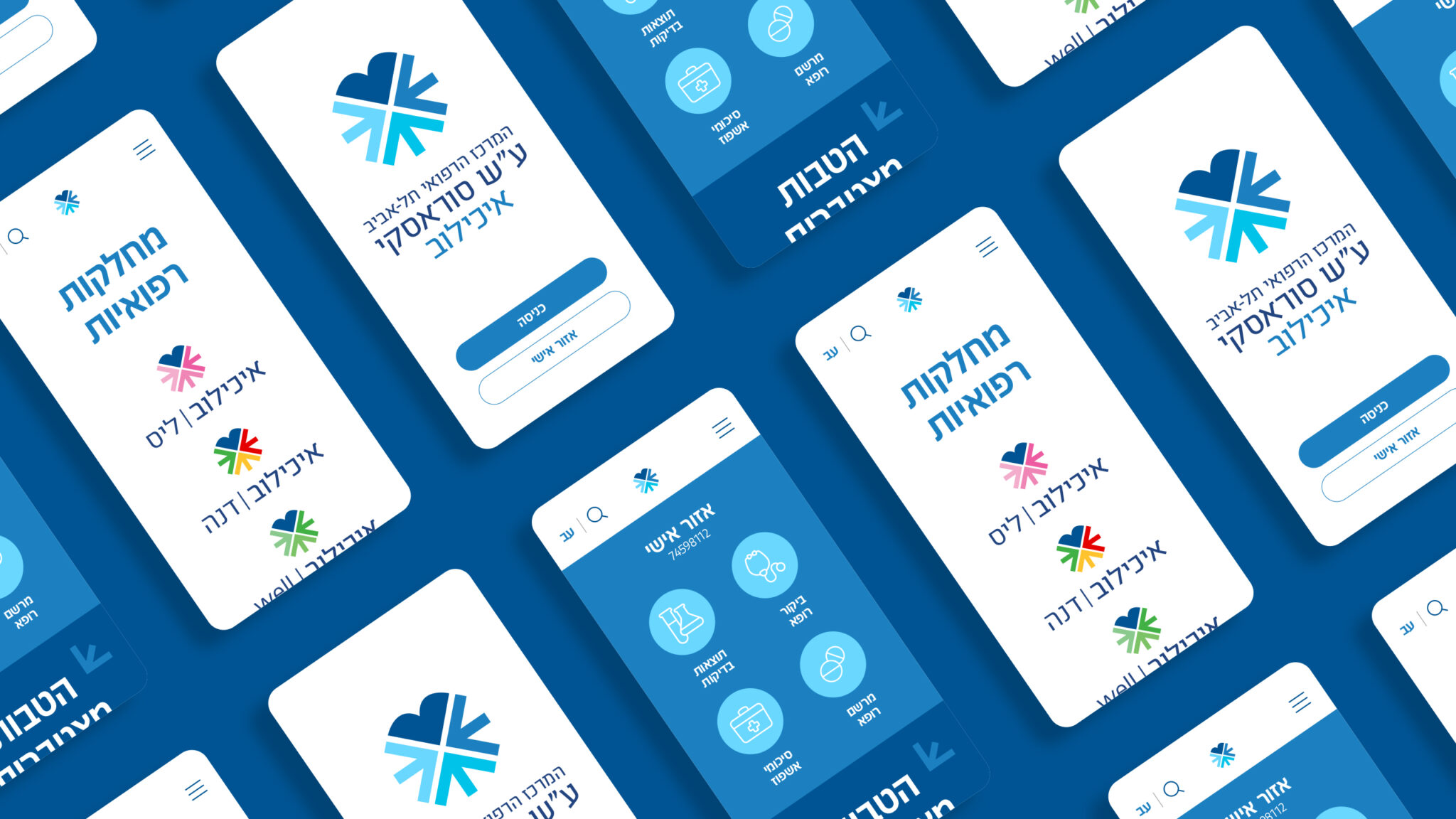
Until recently, each one of its specialized medical services divisions had a different identity and communication approach. Our mission was to help Ichilov formulate a new strategy that would gather all this under the umbrella of one well-known brand people trust to accompany them over the journey of life.
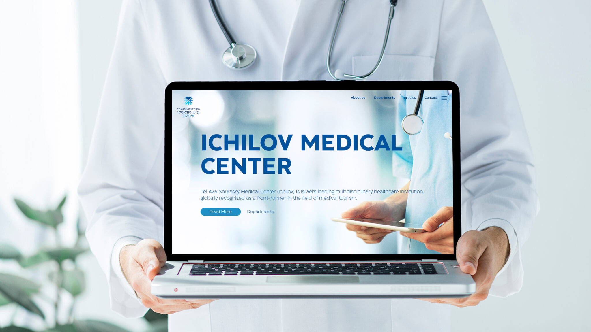
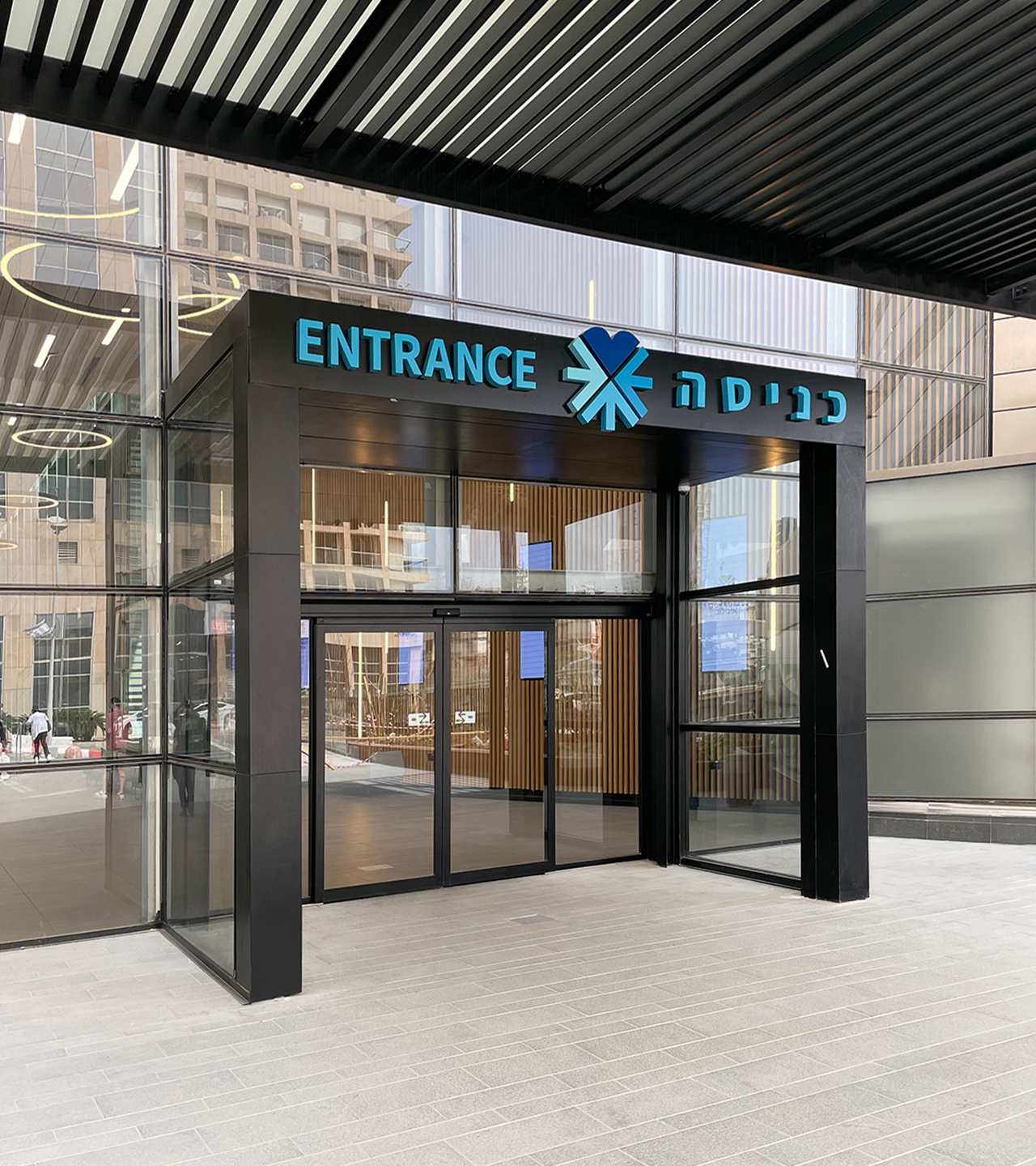
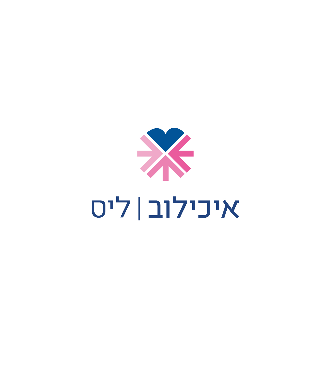
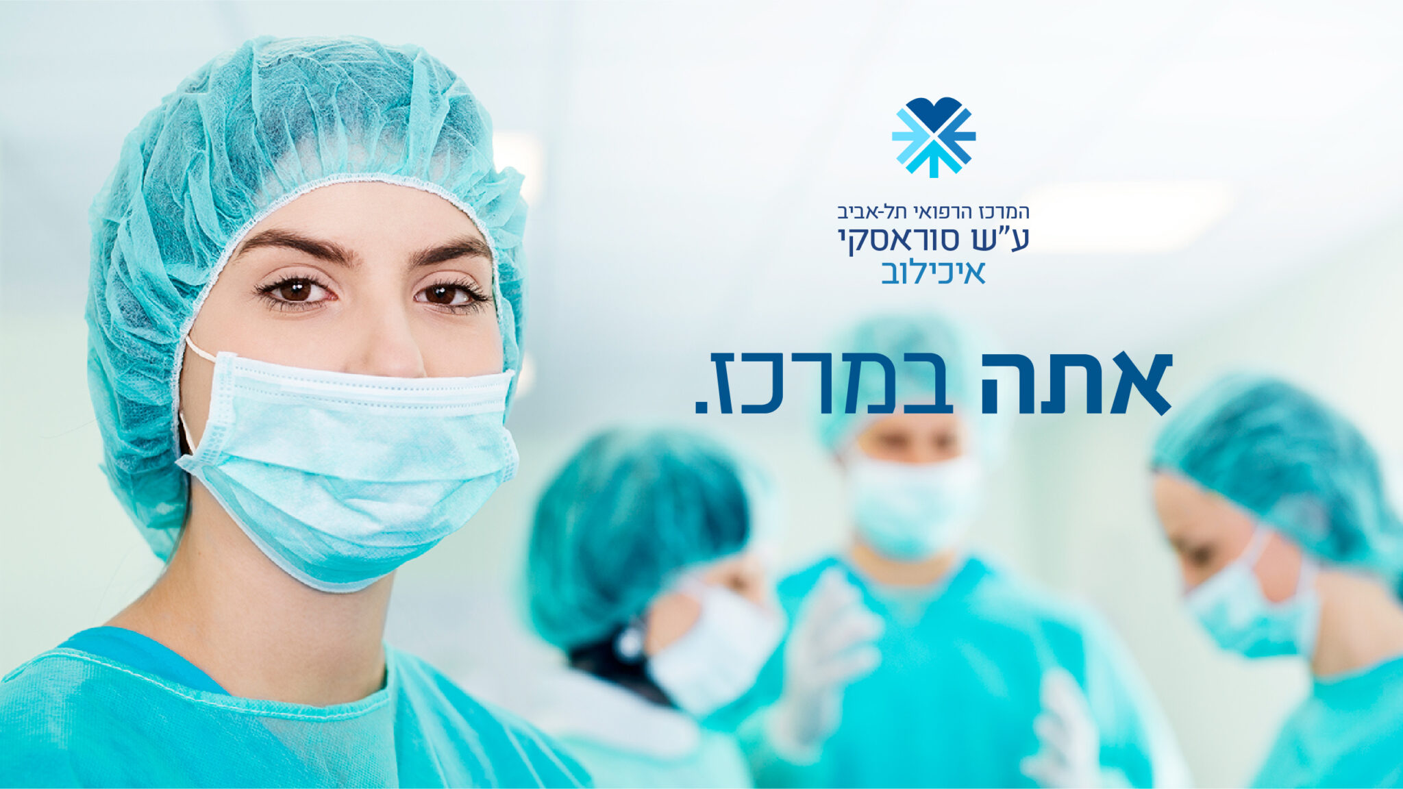
As the branding process evolved, the word Ichilov rose higher up in the hierarchy, and now for the first time, appears prominently in the main logo.
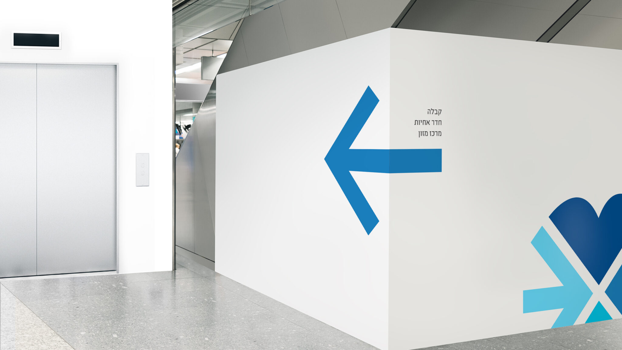
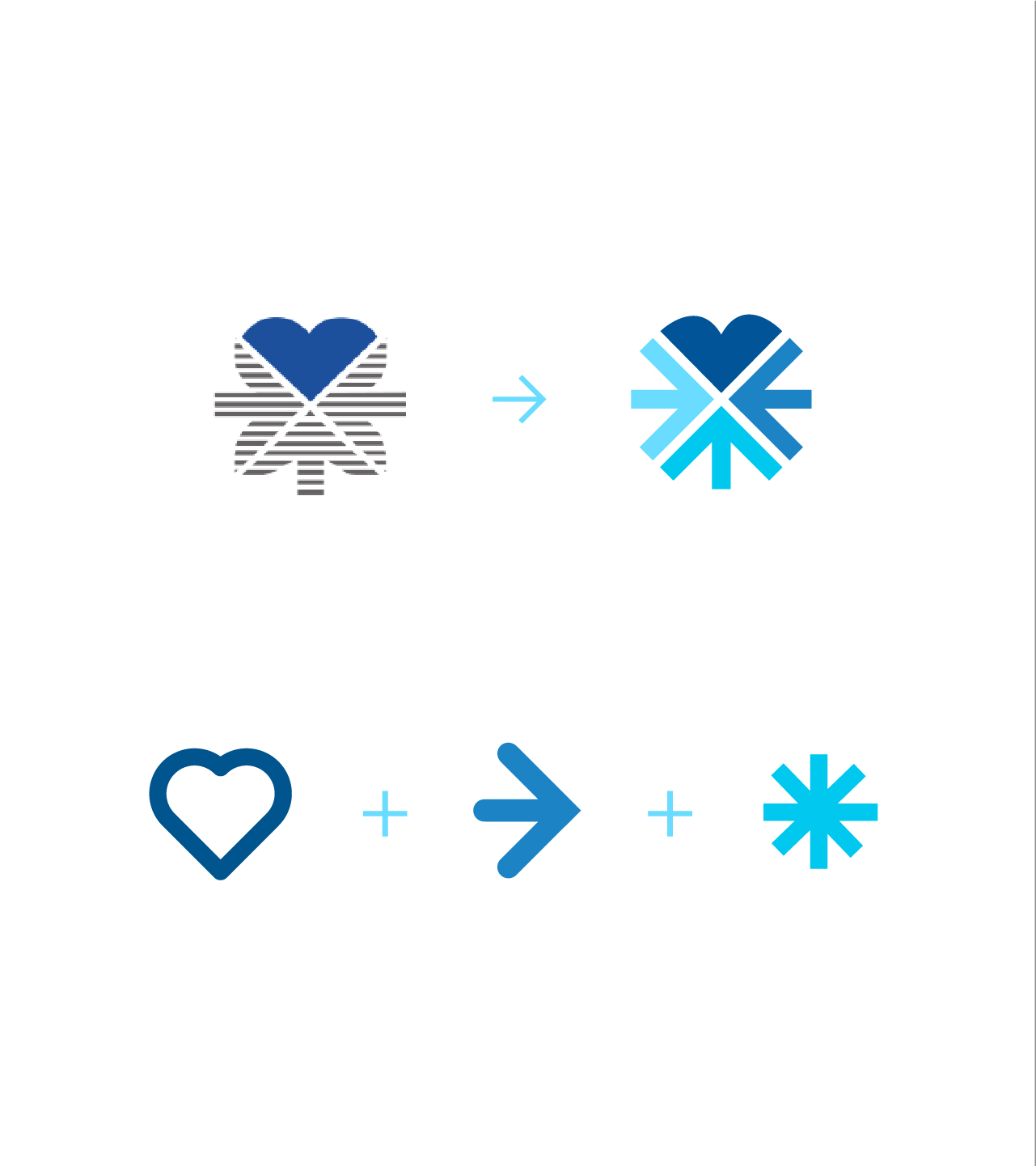
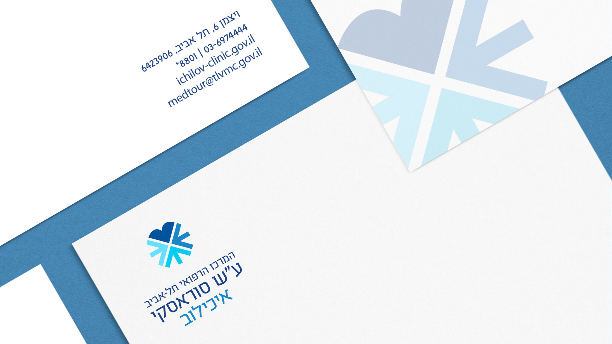
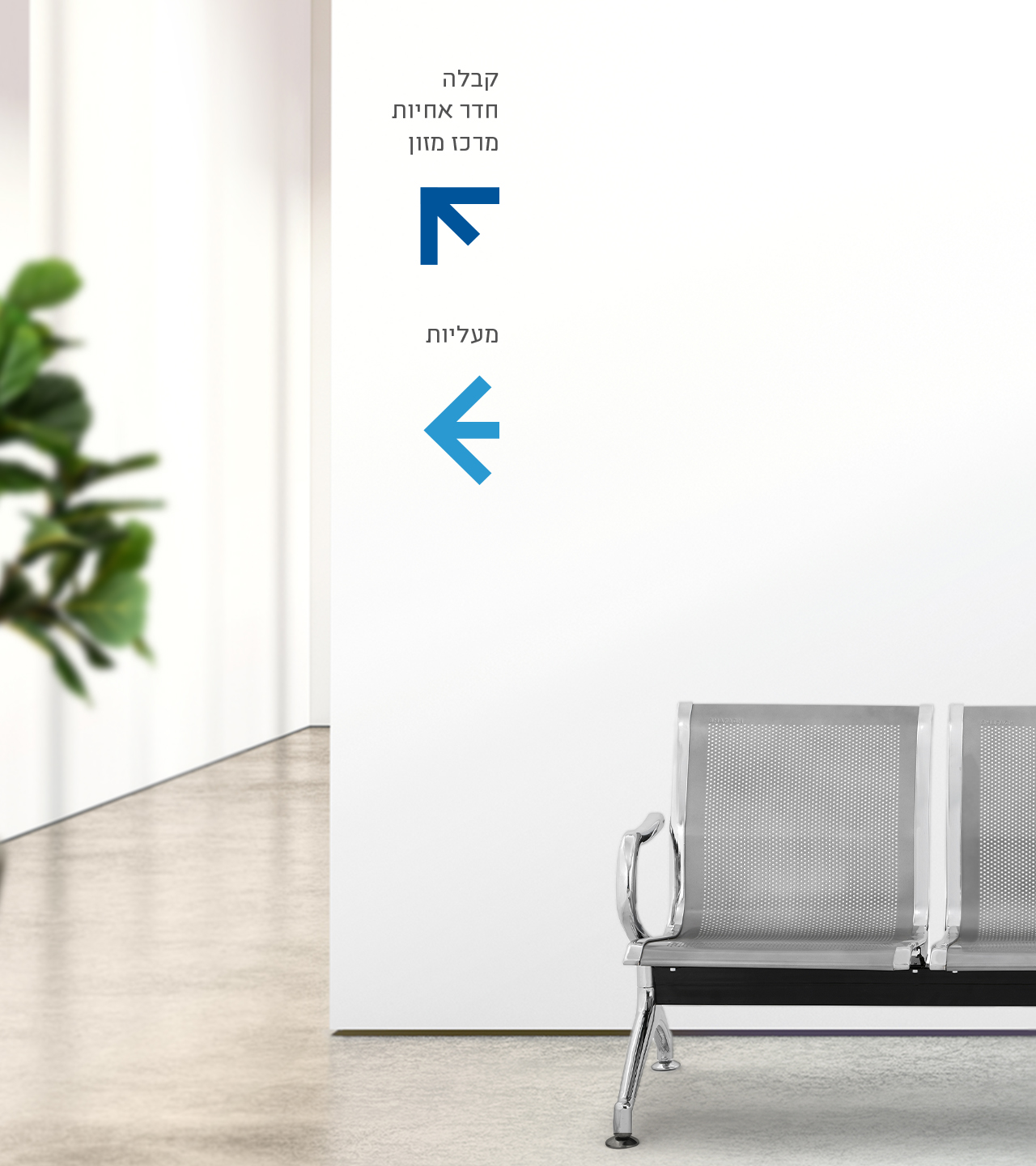
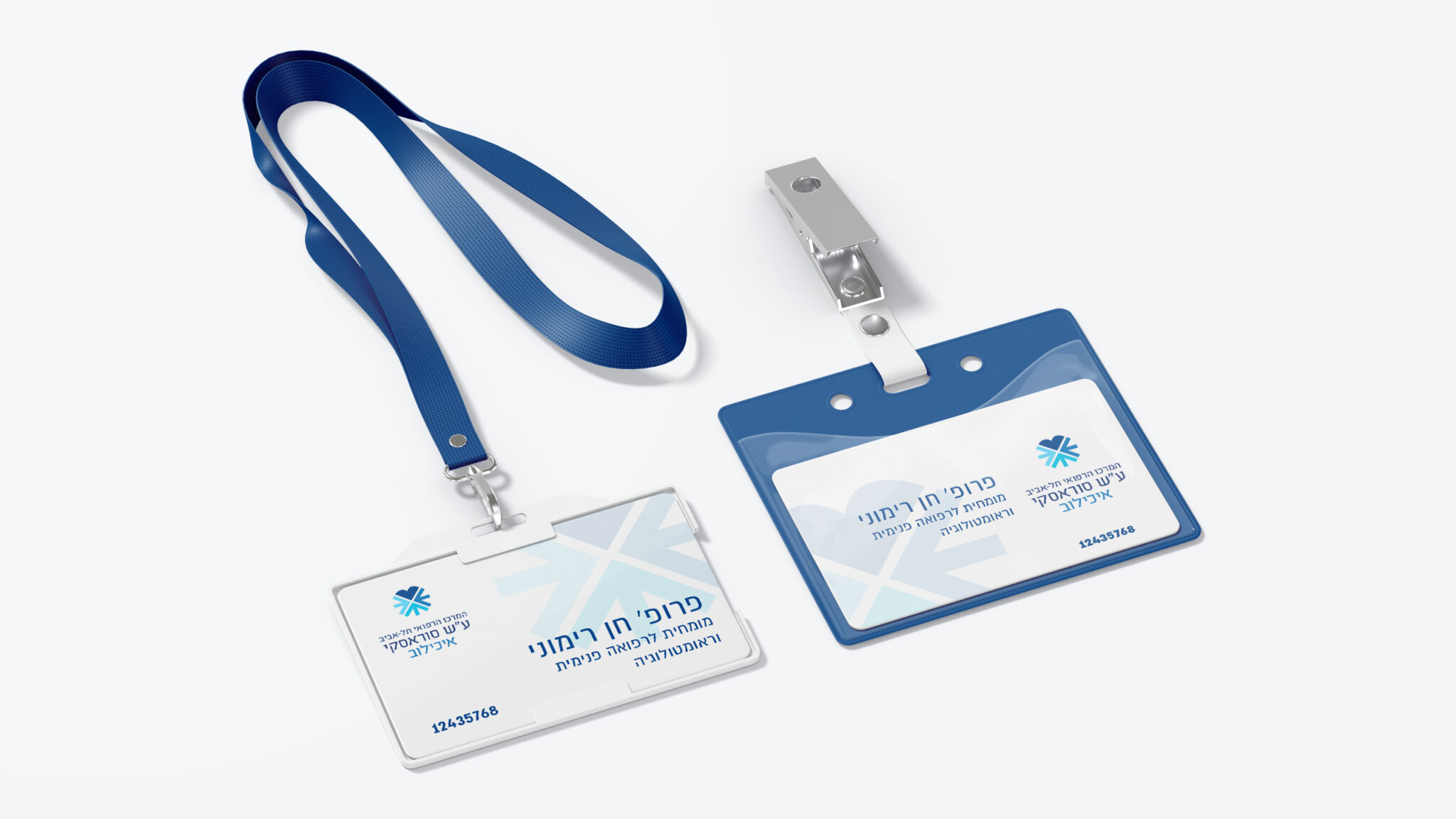
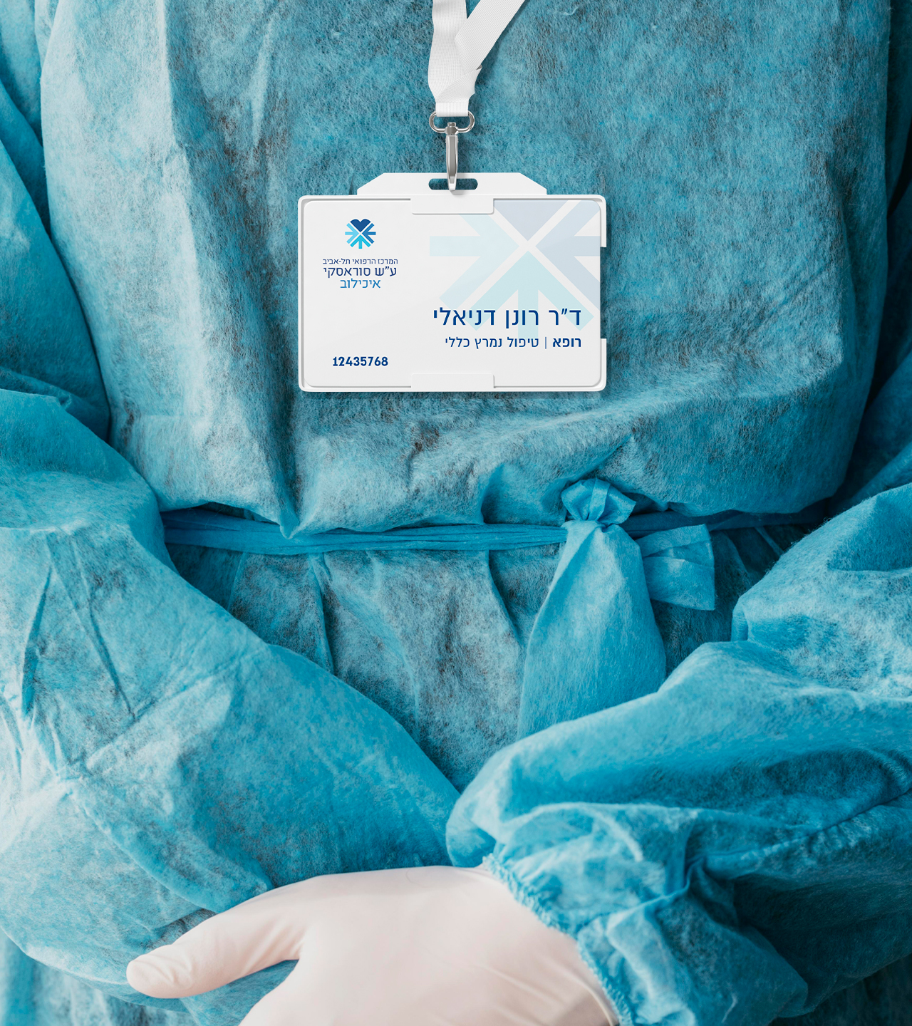
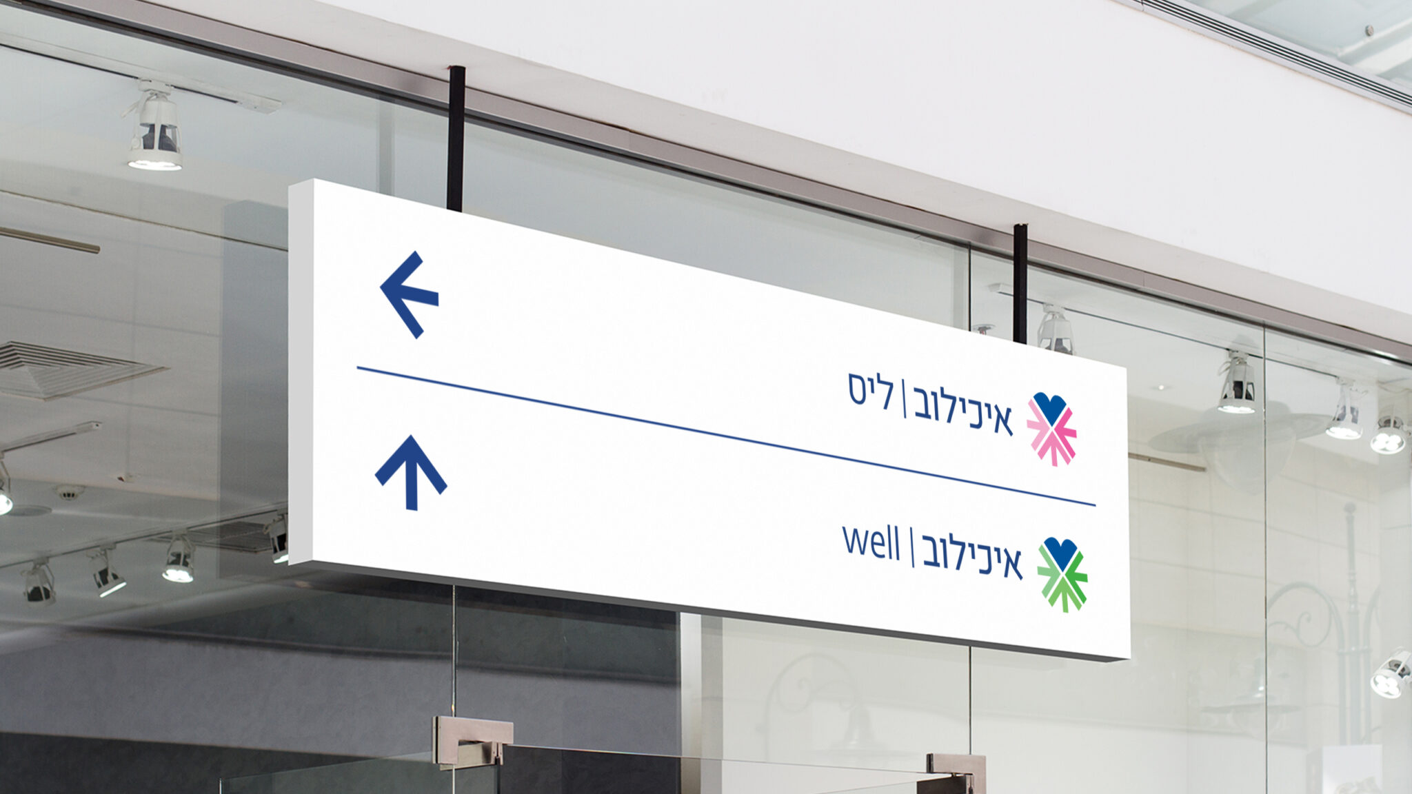
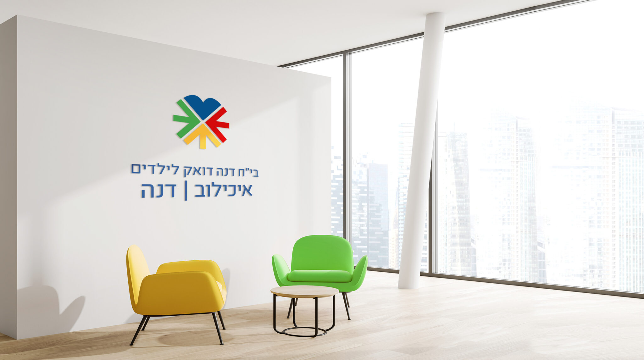
The new family of logos shows the essence of the new visual identity: the heart represents warmth and humaneness, while the arrows symbolize progress and technology leading to the core values: helping people live full, healthy, happy lives. These new elements, adapted to suit each division’s mission, all combine to convey a strong message of reliability, caring, modern efficiency and trust.
