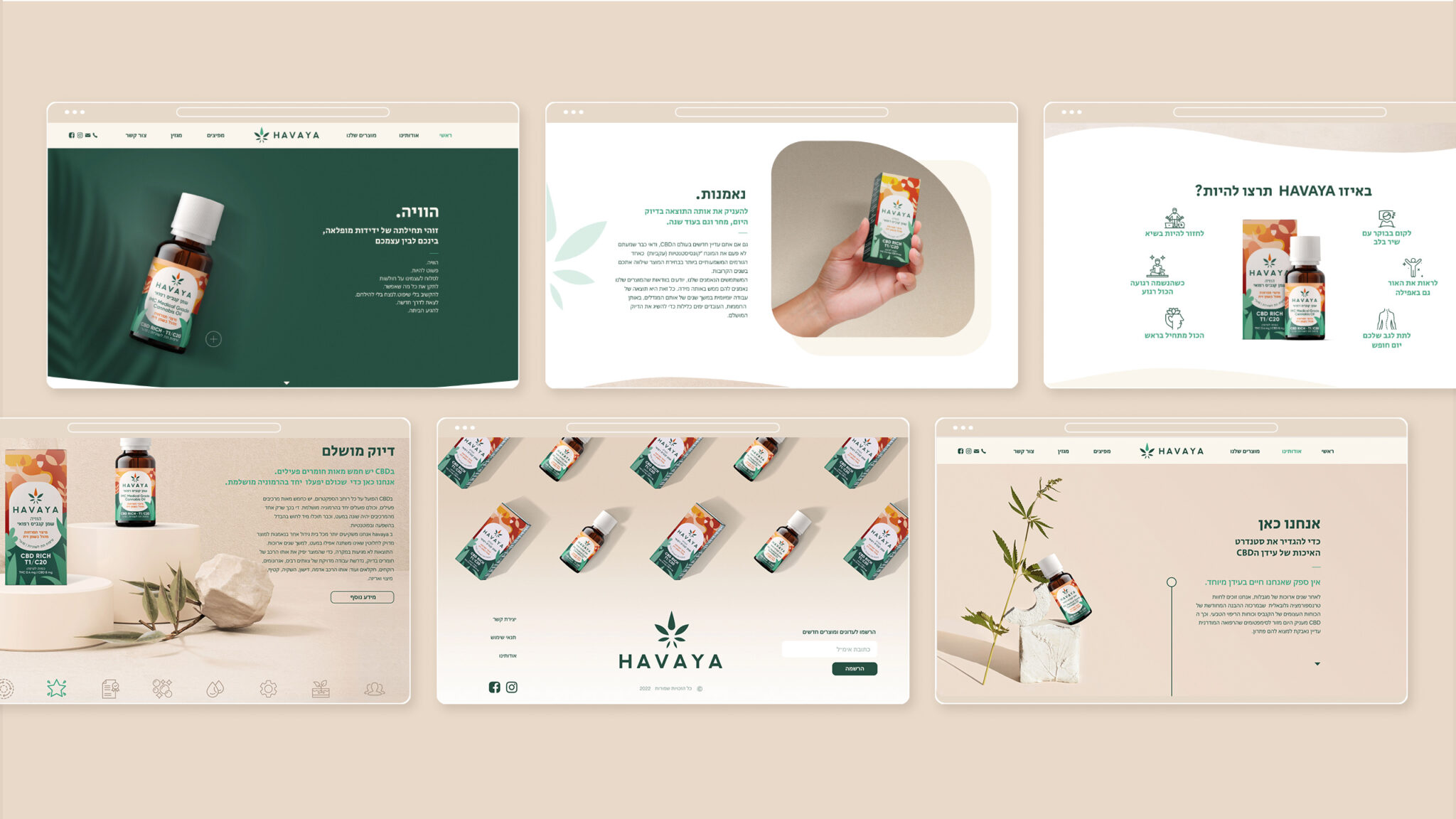
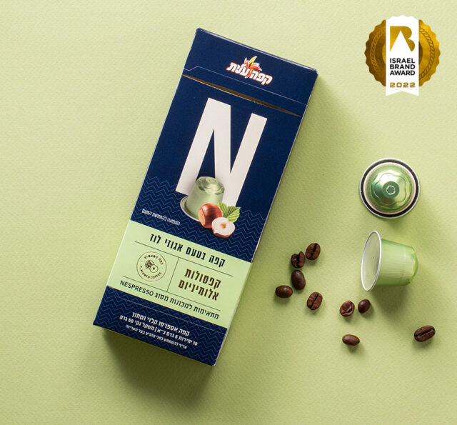
Tikun Olam-Cannbit is Israel’s leading medical cannabis company, with a unique ecosystem that adds value throughout the entire chain starting from growth, cultivation and manufacturing, to distribution, clinical research, training and patient care.
We were asked to help build all the elements of a new brand—the result of a joint venture between 3 companies, each one a leader in its field: Tikun Olam-Cannbit, Meditrend, specializing in nutritional supplements, and Pelter wineries.
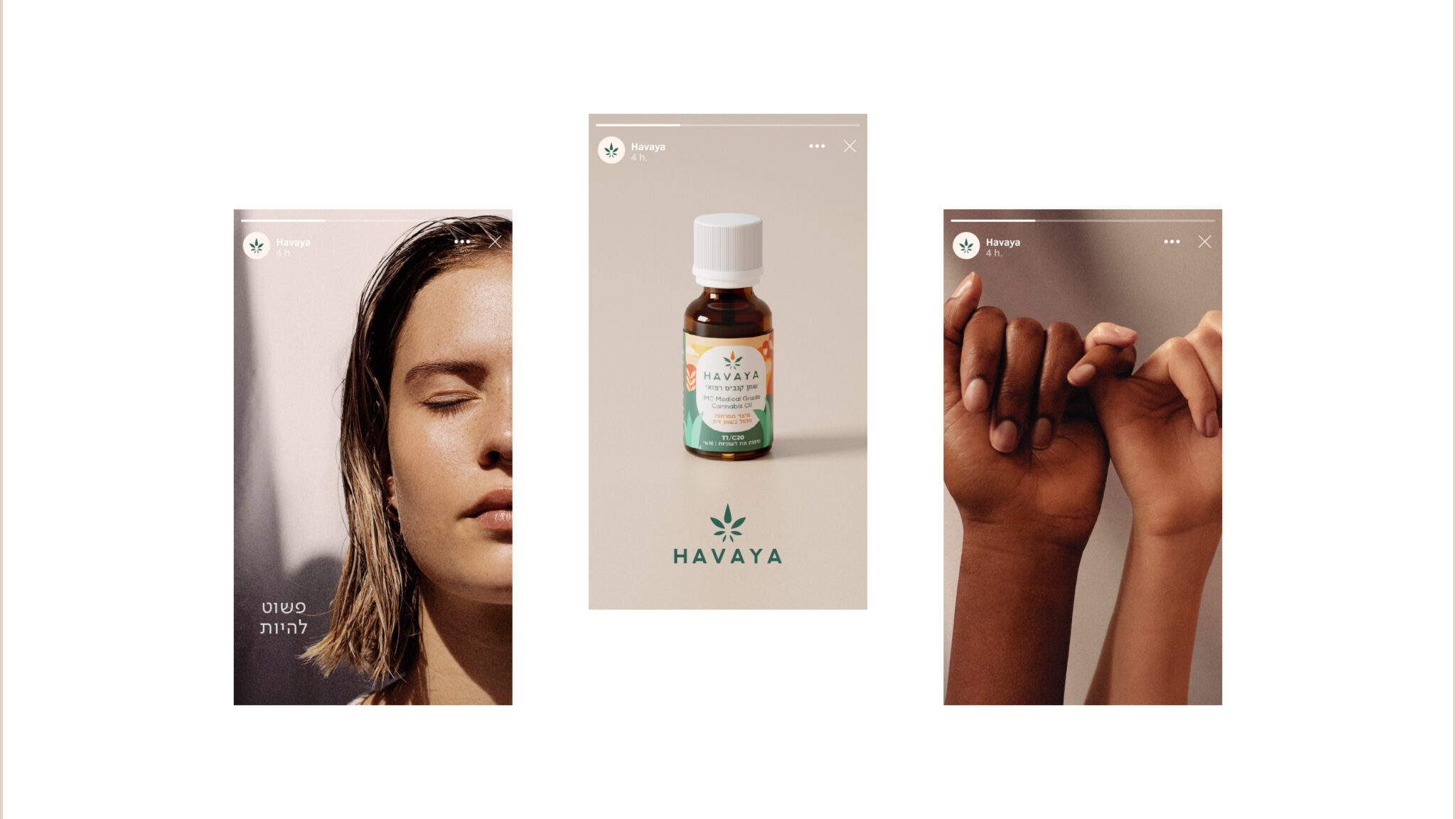
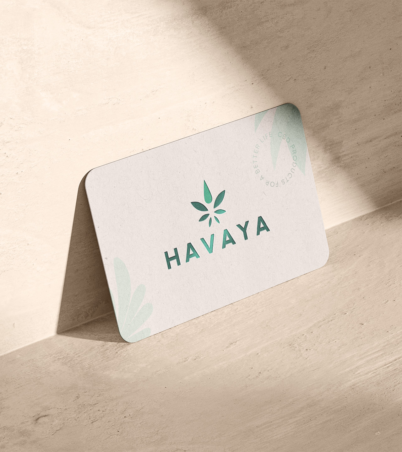
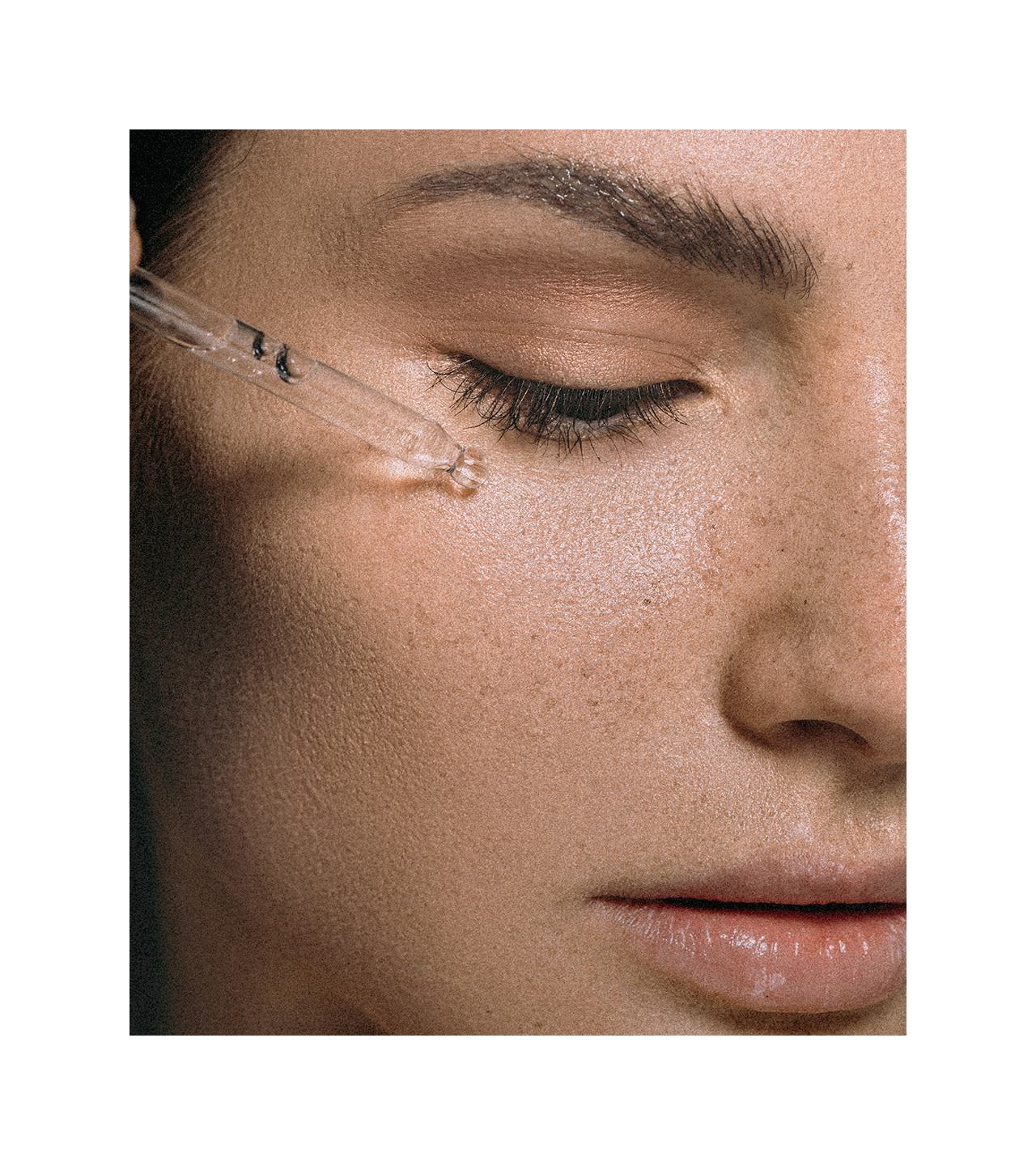
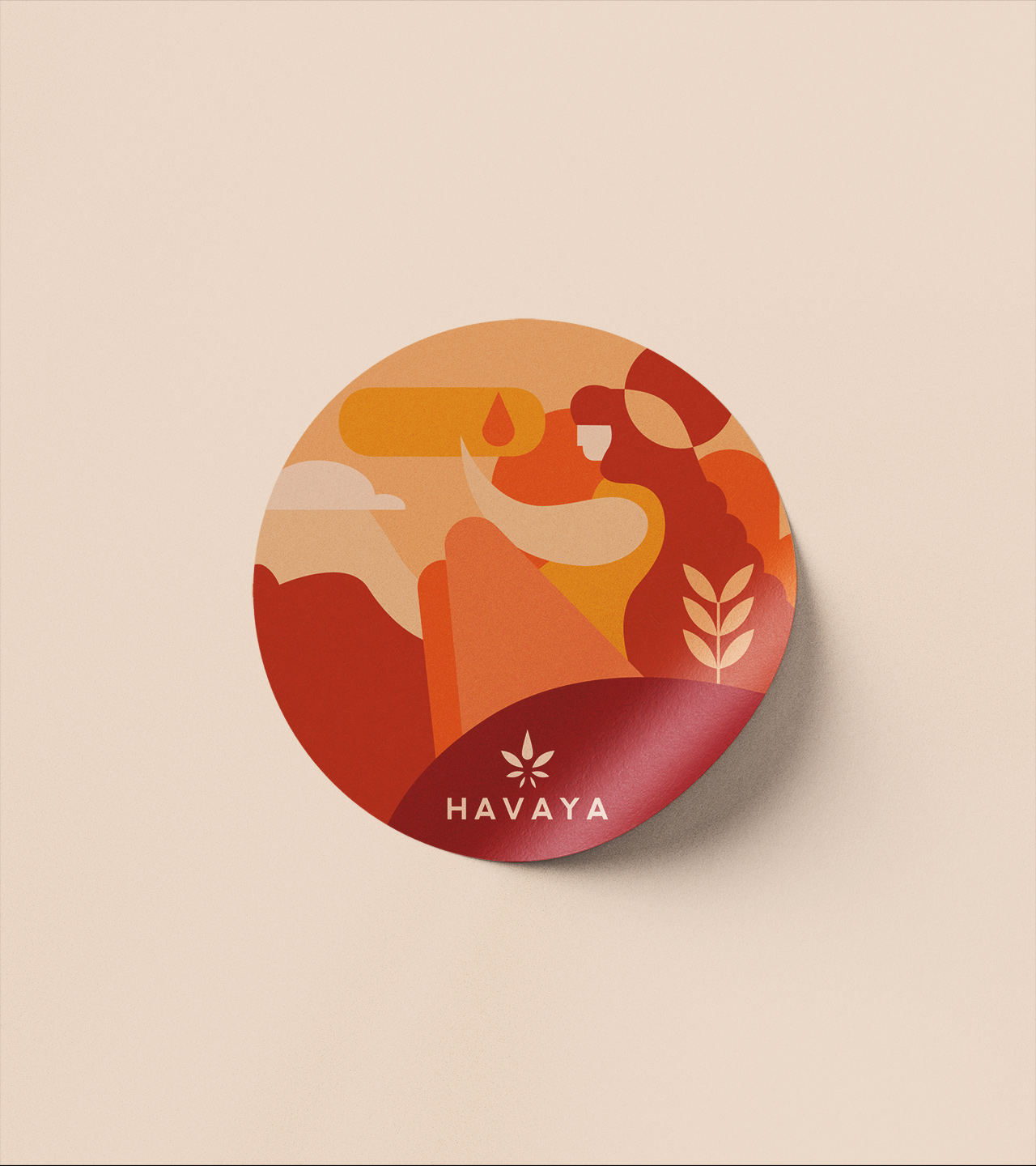
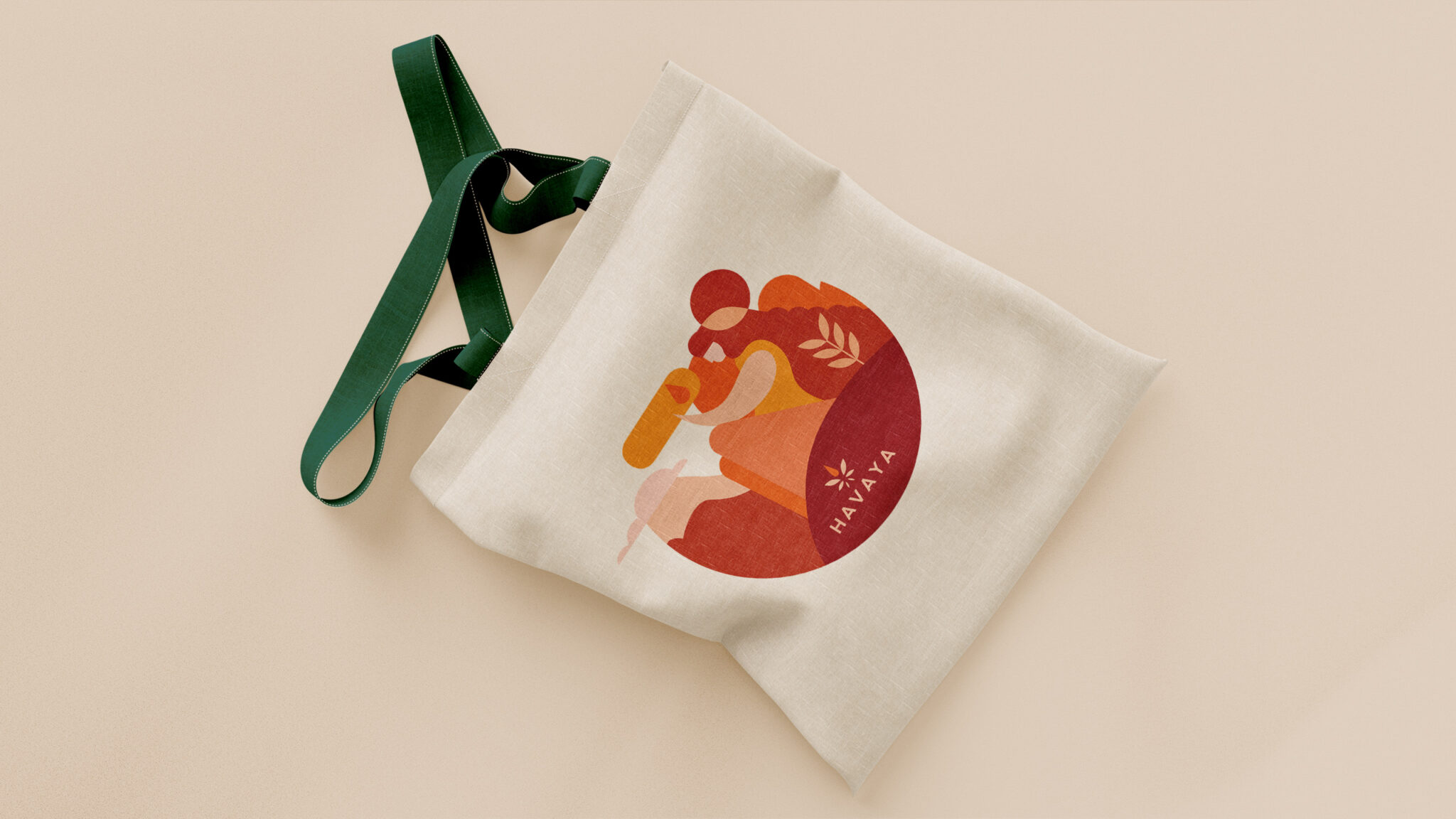
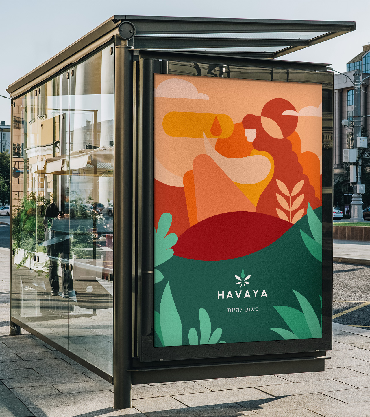
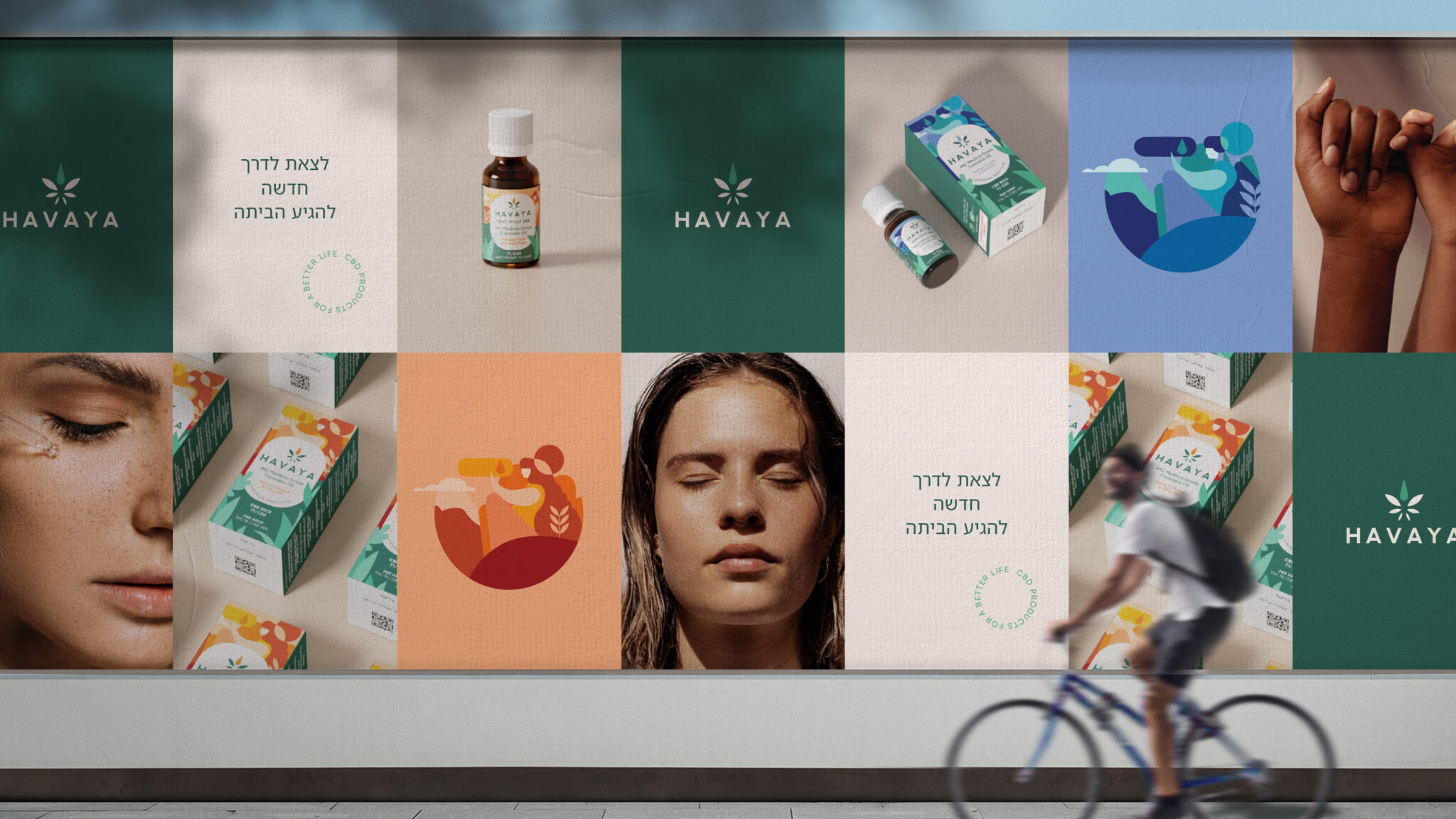
The Hebrew term Havaya means existence. Simply being. Havaya is all about innovation and inspiration, but also uncompromising quality. Backed by science, it can stand strong vis-à-vis the competition from abroad that is about to arrive. We believe Cannabis is a gift from nature that heals and restores balance to body and soul, empowering people to choose their own experiences.
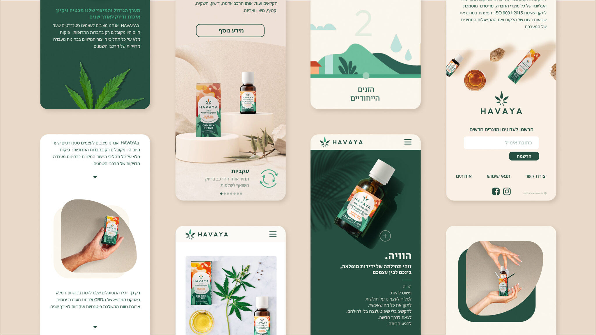
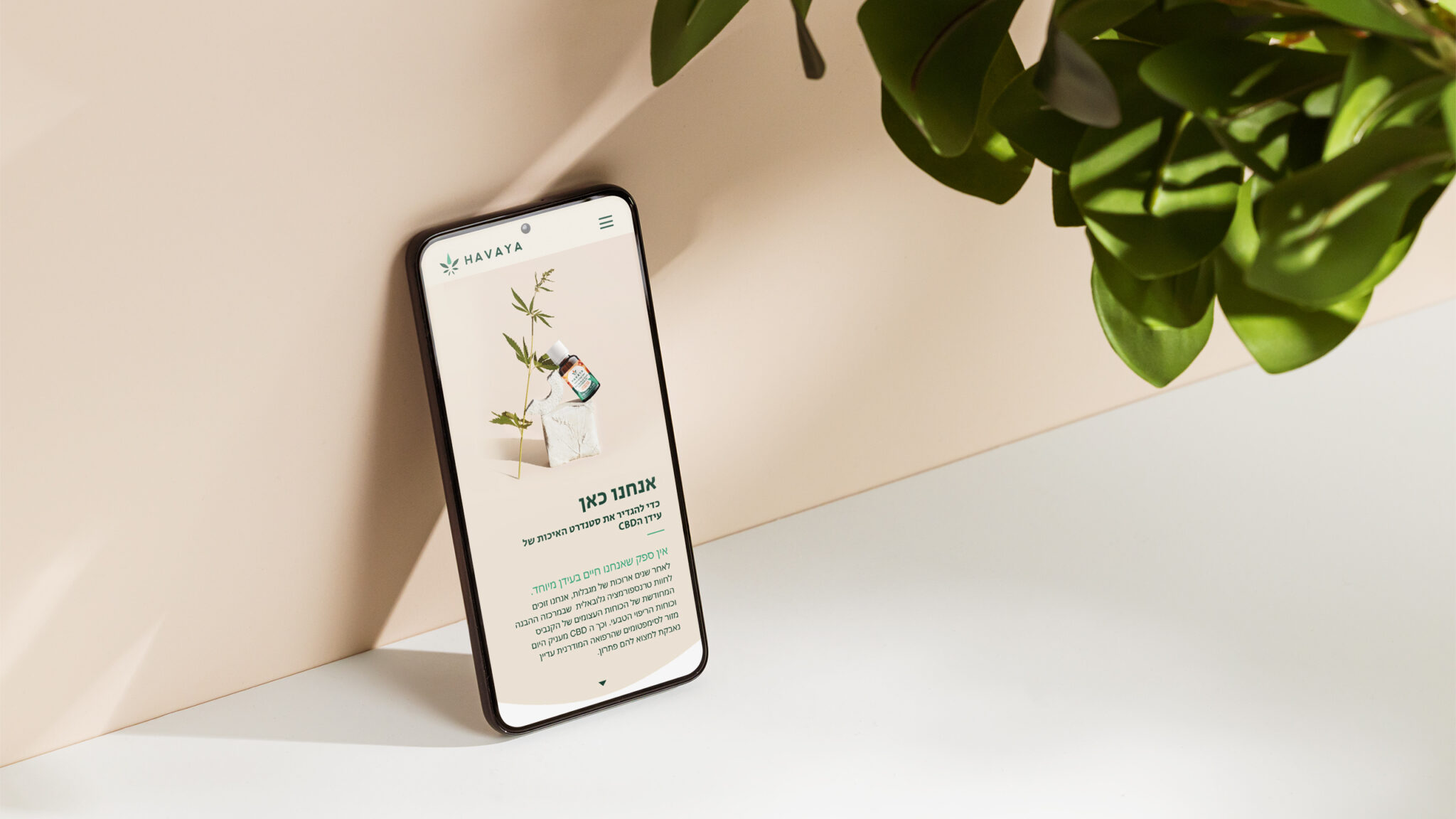
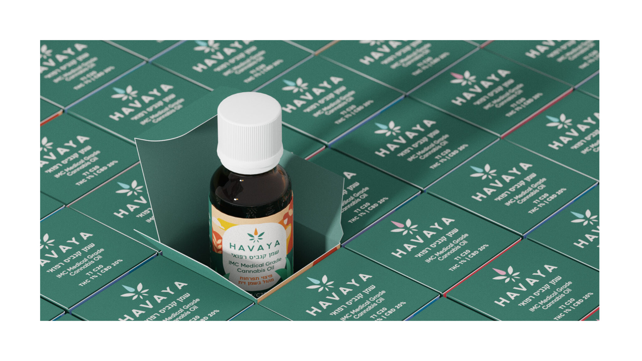
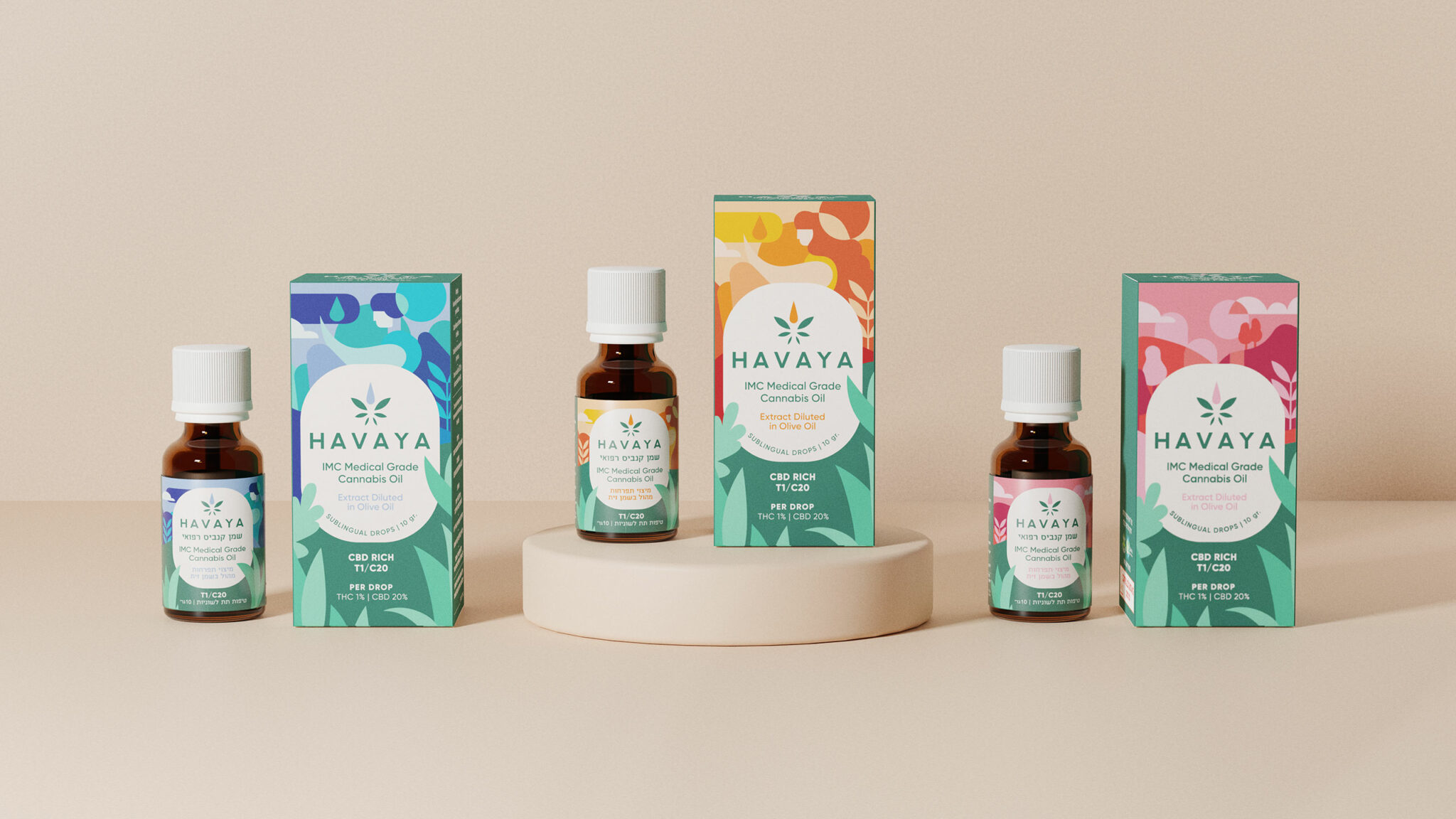
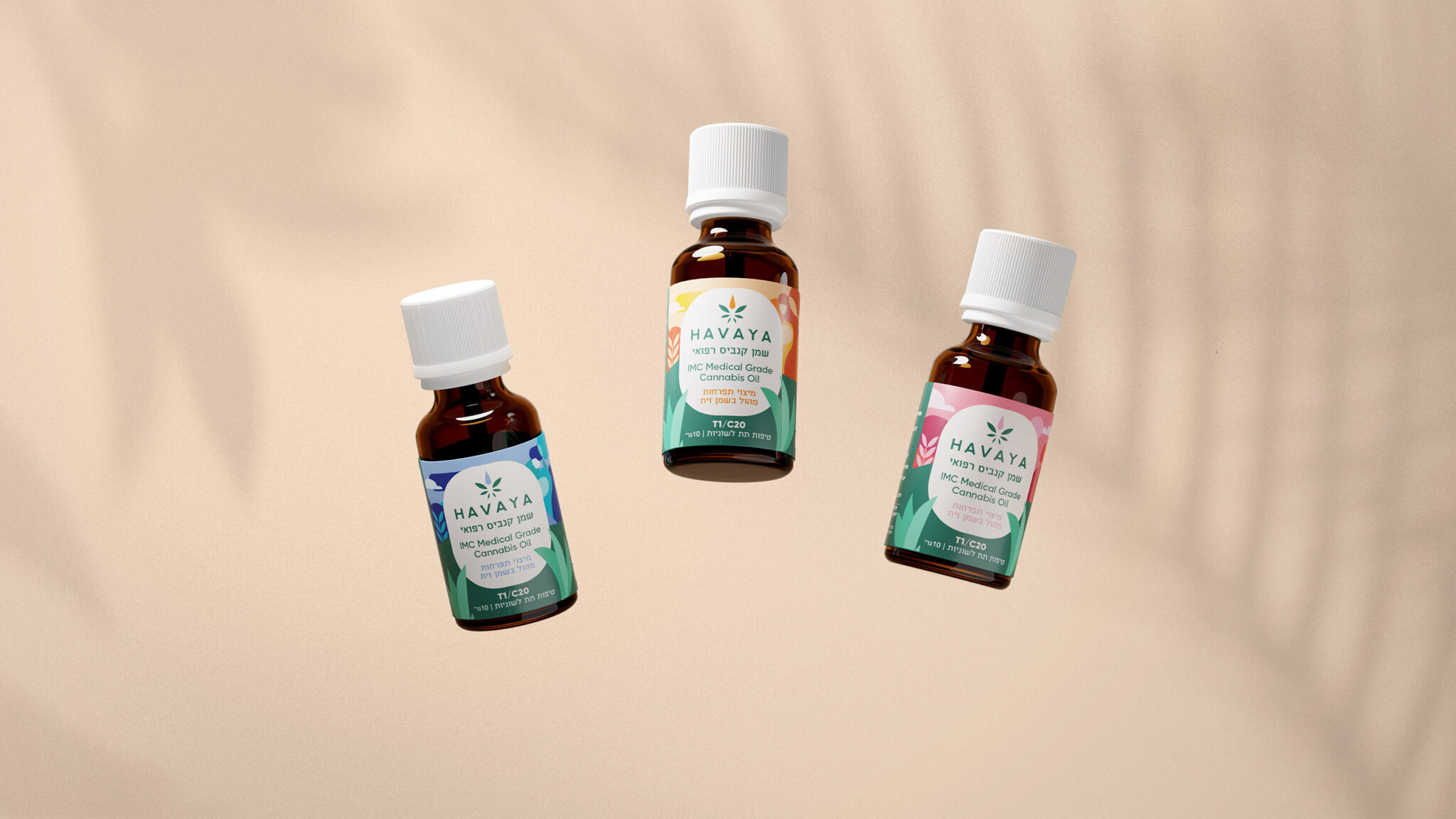
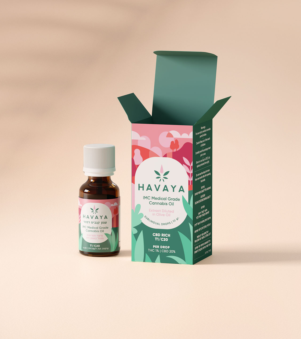
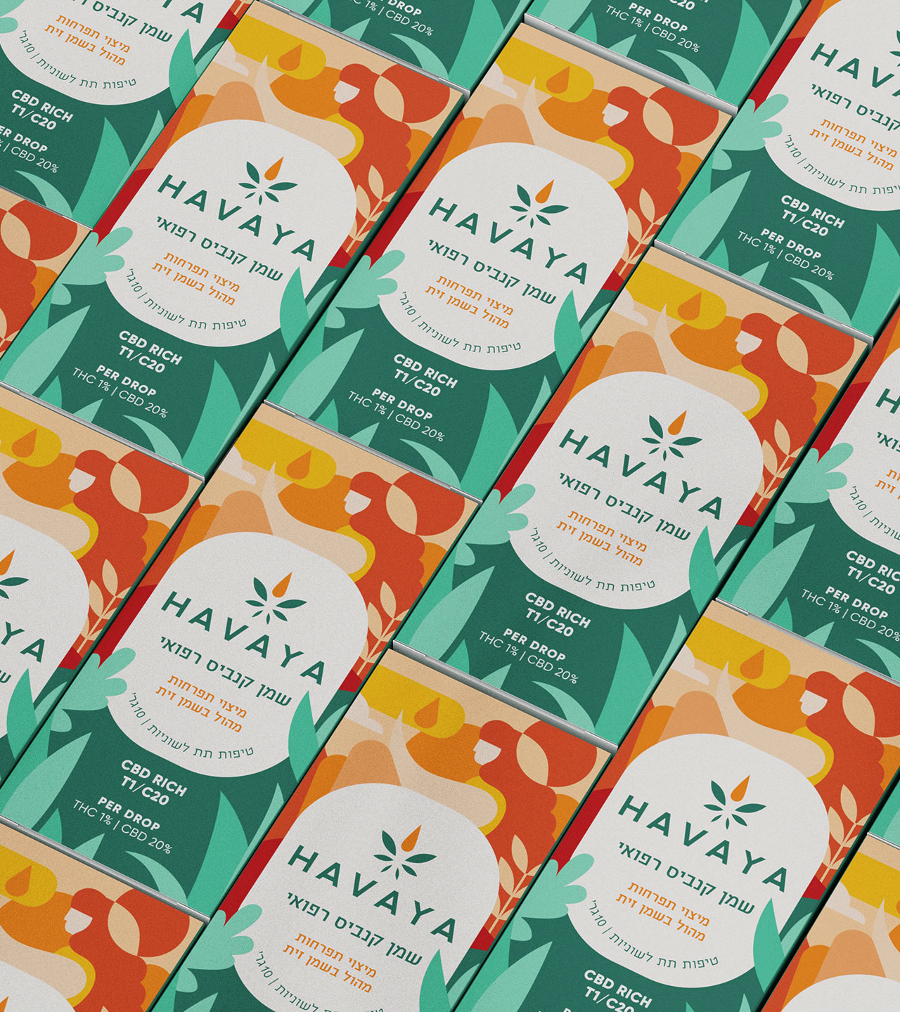
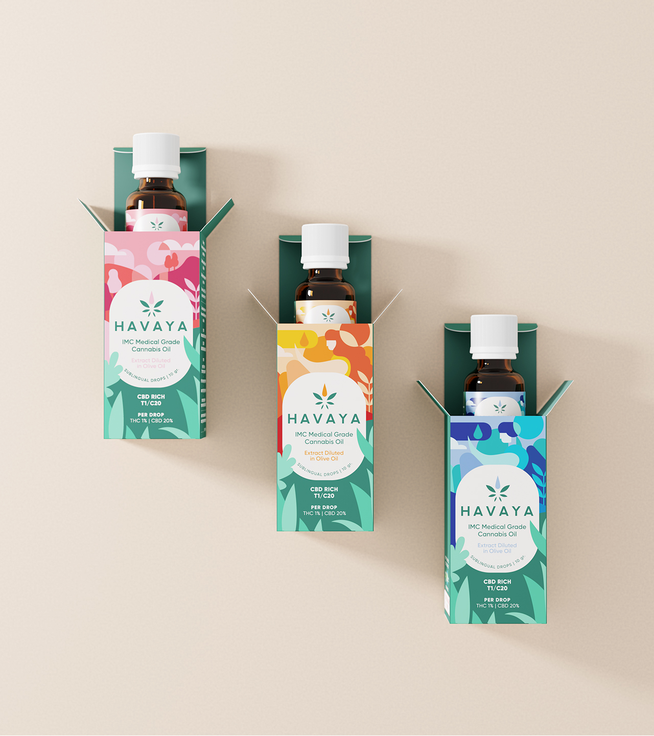
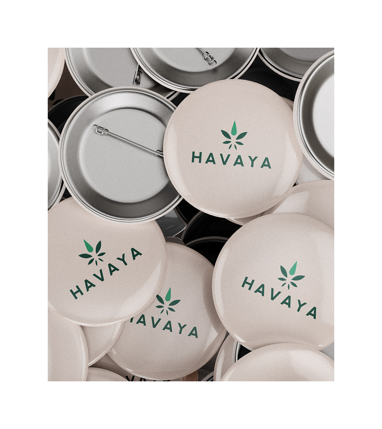
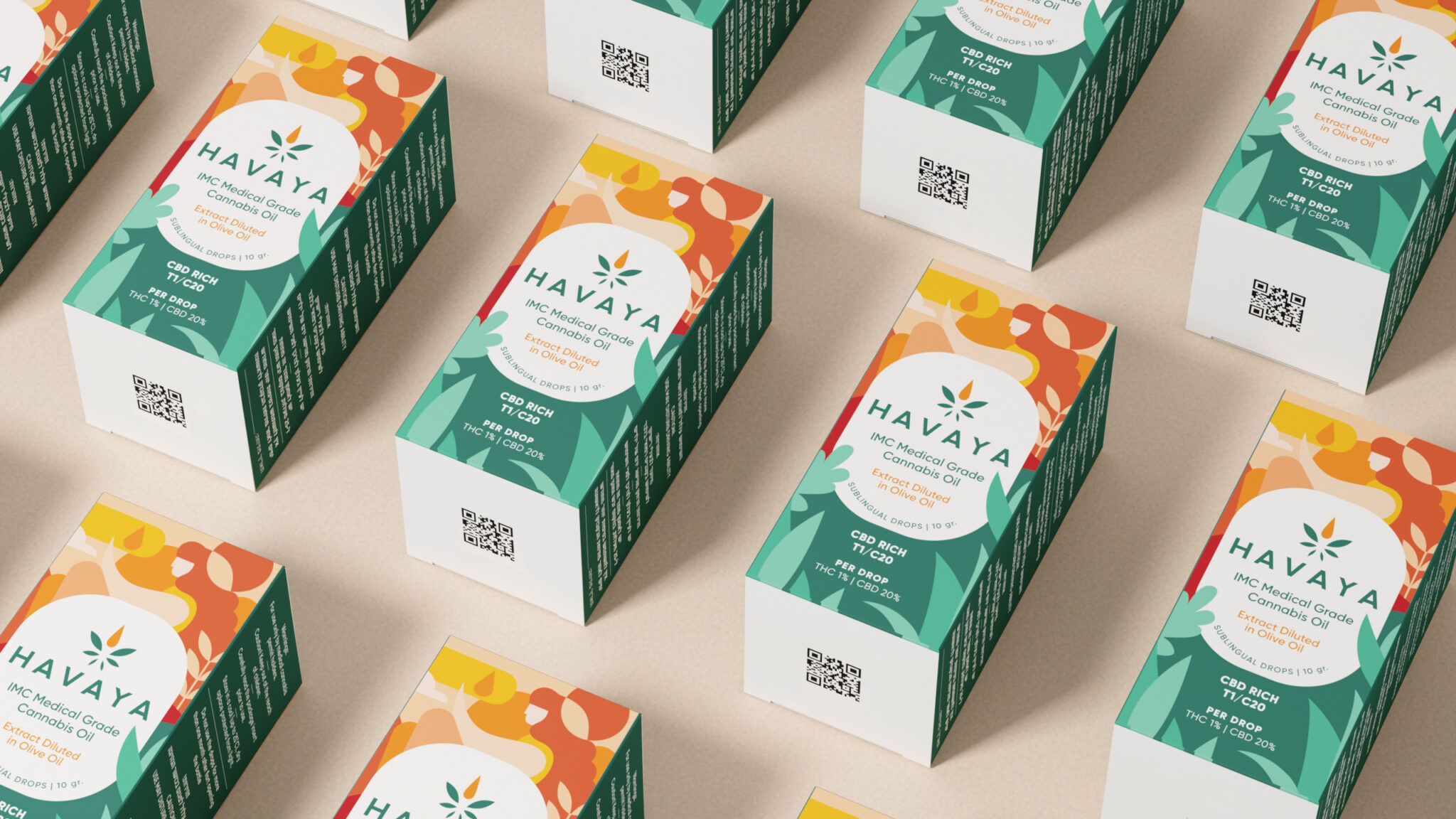
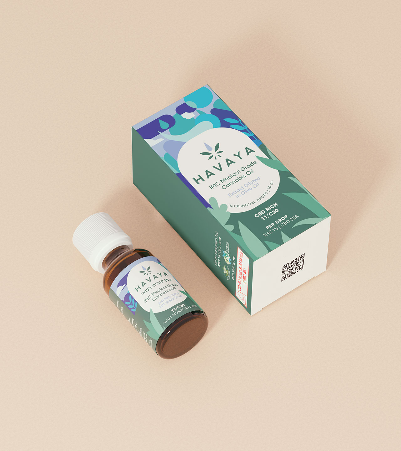
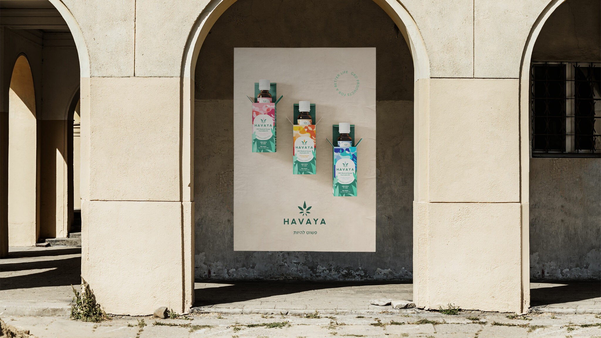
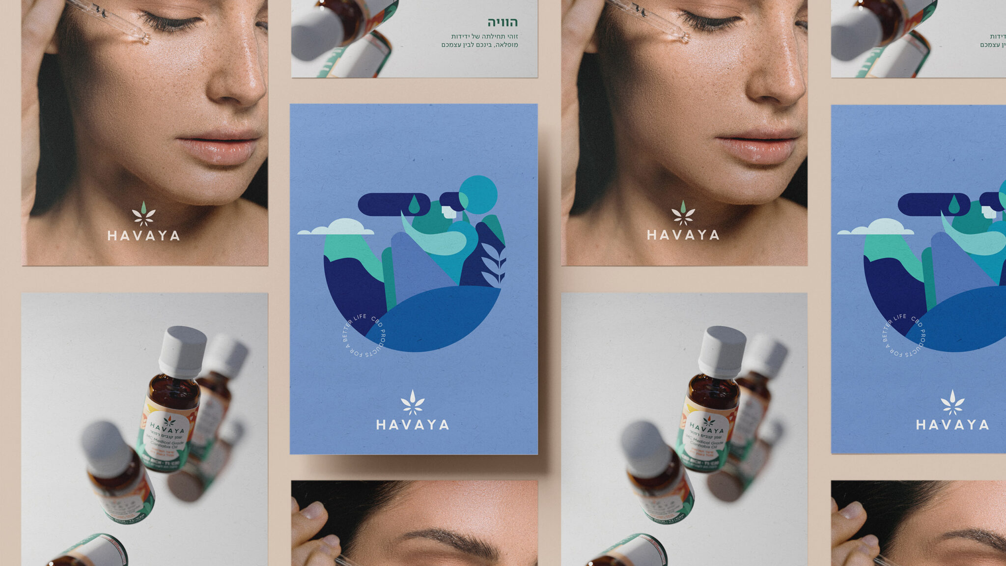
As the company’s Cannabis offering evolved, the graphics went from a very medical, cold, rigid look, into a softer understated style that conveys wellness and life improvement. Our choice was a blend of earth colors and greens, combined with shades of blue. The graphic language is subtle and naïve. The artwork on each product clearly indicates the benefit it delivers. We’ve led this project from the start: strategy, naming, branding, packaging, website, and social media.


Tikun Olam-Cannbit is Israel’s leading medical cannabis company, with a unique ecosystem that adds value throughout the entire chain starting from growth, cultivation and manufacturing, to distribution, clinical research, training and patient care.
We were asked to help build all the elements of a new brand—the result of a joint venture between 3 companies, each one a leader in its field: Tikun Olam-Cannbit, Meditrend, specializing in nutritional supplements, and Pelter wineries.
The Hebrew term Havaya means existence. Simply being. Havaya is all about innovation and inspiration, but also uncompromising quality. Backed by science, it can stand strong vis-à-vis the competition from abroad that is about to arrive. We believe Cannabis is a gift from nature that heals and restores balance to body and soul, empowering people to choose their own experiences.
As the company’s Cannabis offering evolved, the graphics went from a very medical, cold, rigid look, into a softer understated style that conveys wellness and life improvement. Our choice was a blend of earth colors and greens, combined with shades of blue. The graphic language is subtle and naïve. The artwork on each product clearly indicates the benefit it delivers. We’ve led this project from the start: strategy, naming, branding, packaging, website, and social media.