This rebranding process was based on Bezeq International's strengths and DNA, an outstanding combination of technology, innovation and excellence on the one hand, and a human perspective of people, who live and work in the cutting edge of technology on the other. A new language was born out of a vision to spearhead technological growth engines devoted to companies and people, allowing them to fulfill their objectives.
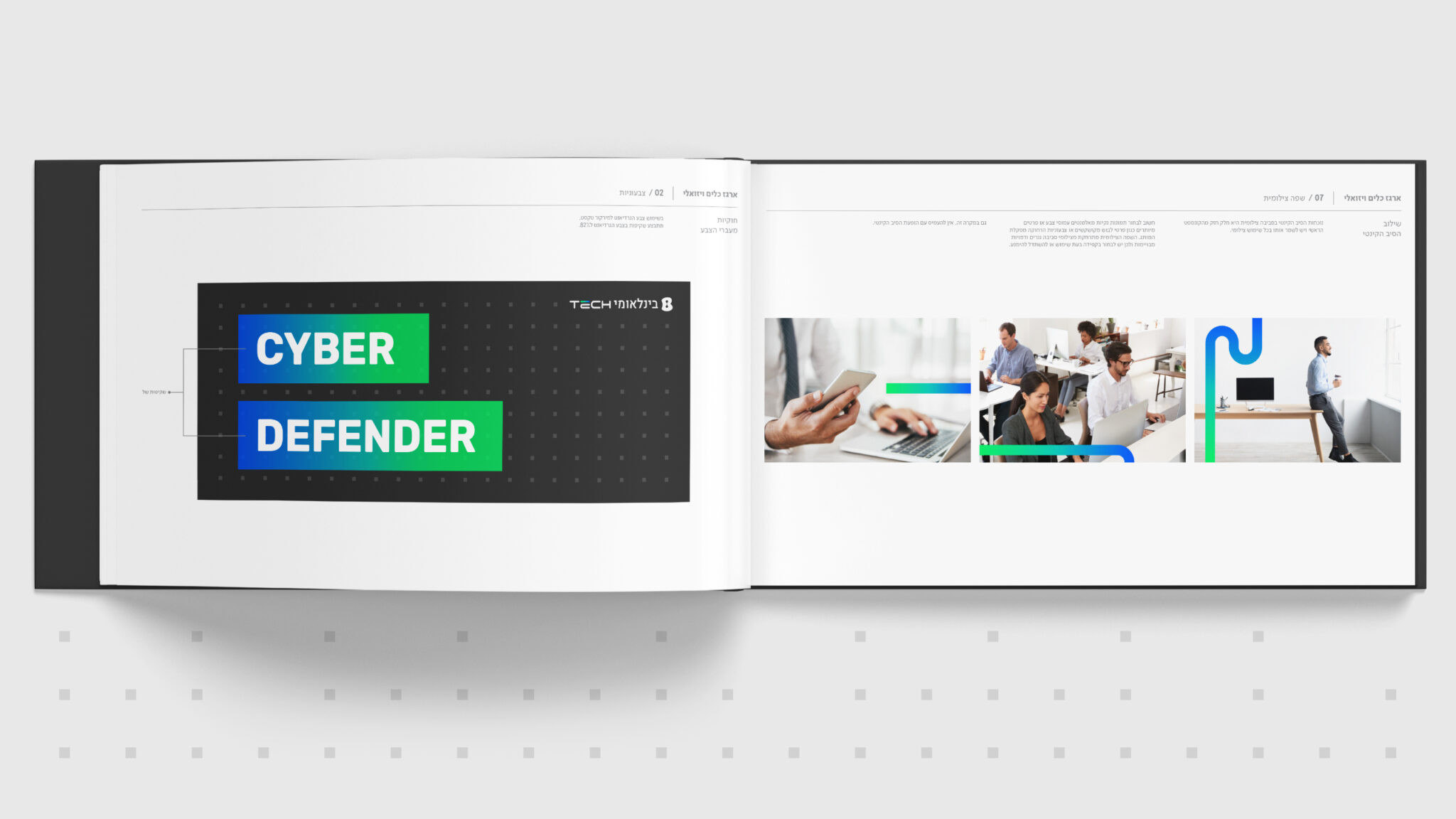
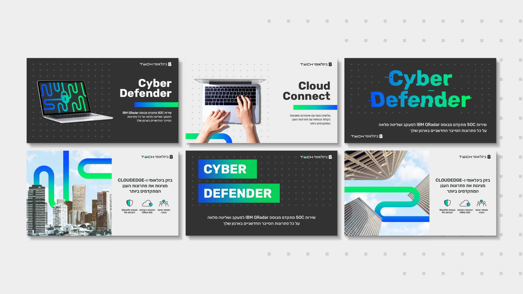
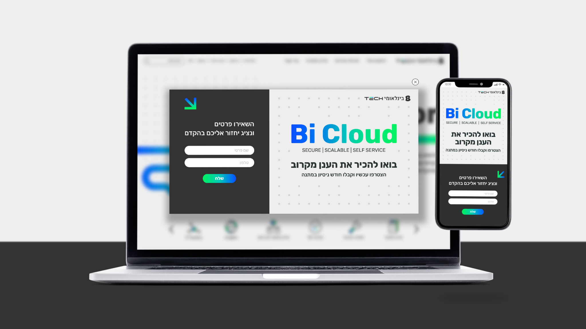
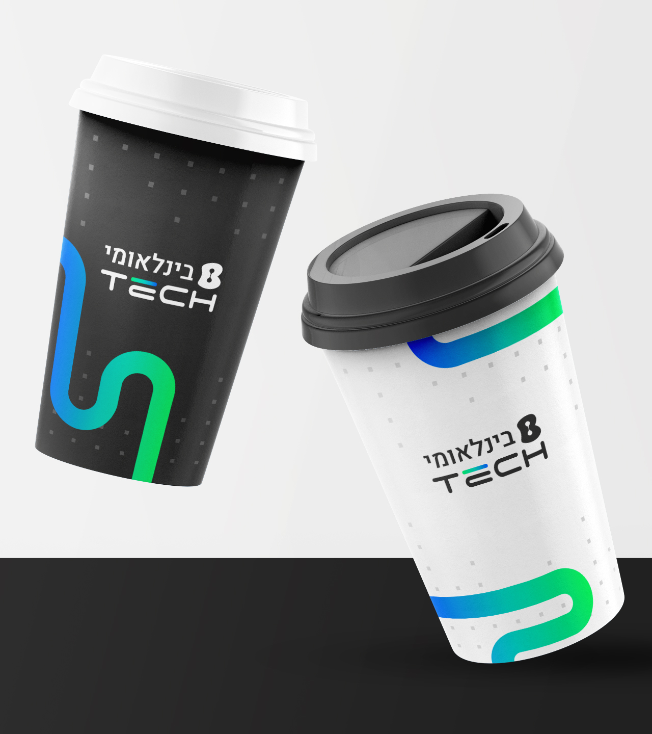
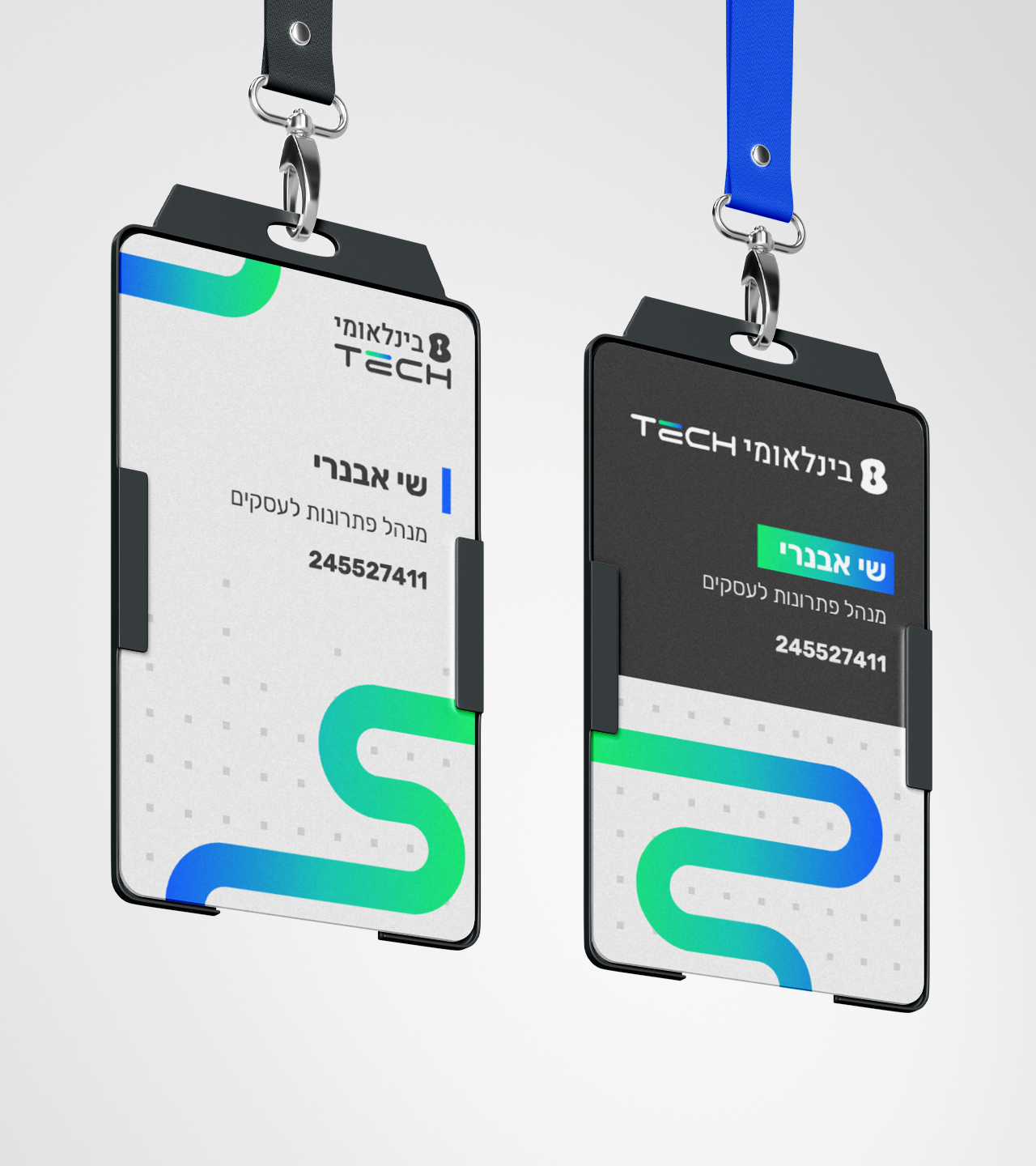
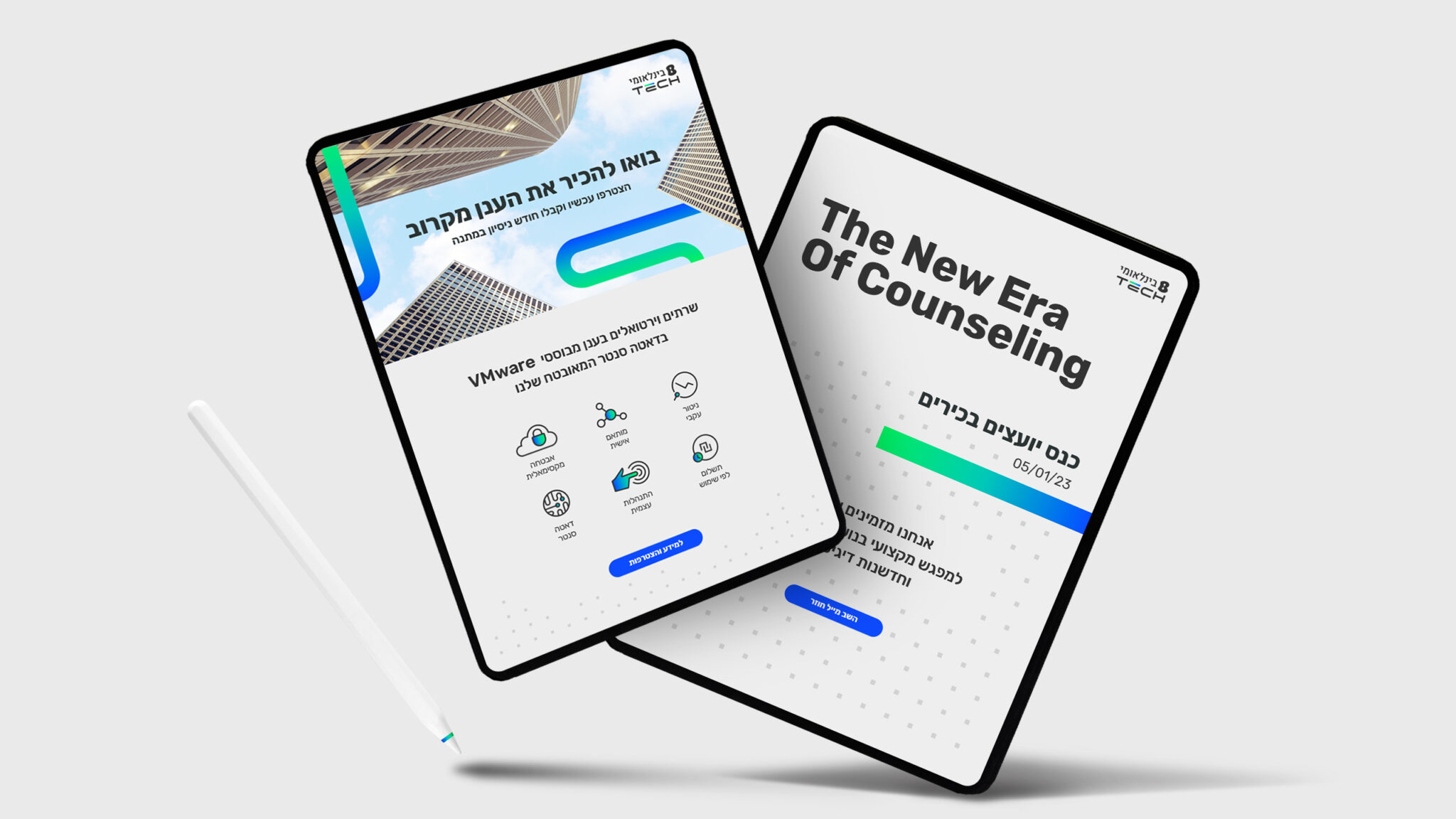
In this new take, the word tech appears on the same hierarchical level as the word international, signaling the company's renewed business focus. The letters have rounded corners, highlighting the human side and service orientation – the main strengths of the company. These keywords are connected by a kinetic fiber designed in colors that go from green to blue, just as the transition of the old Bezeq International to the new.
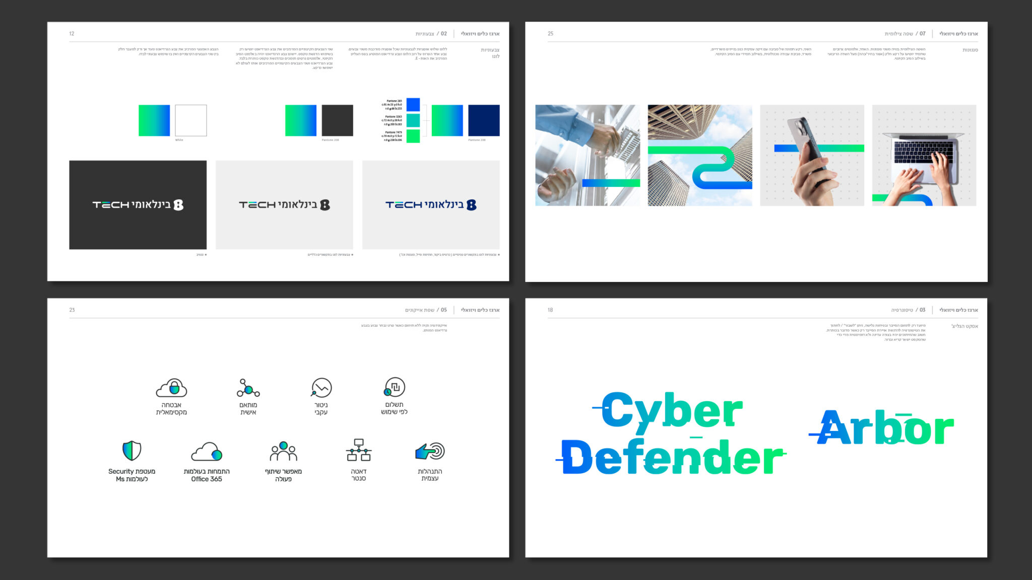
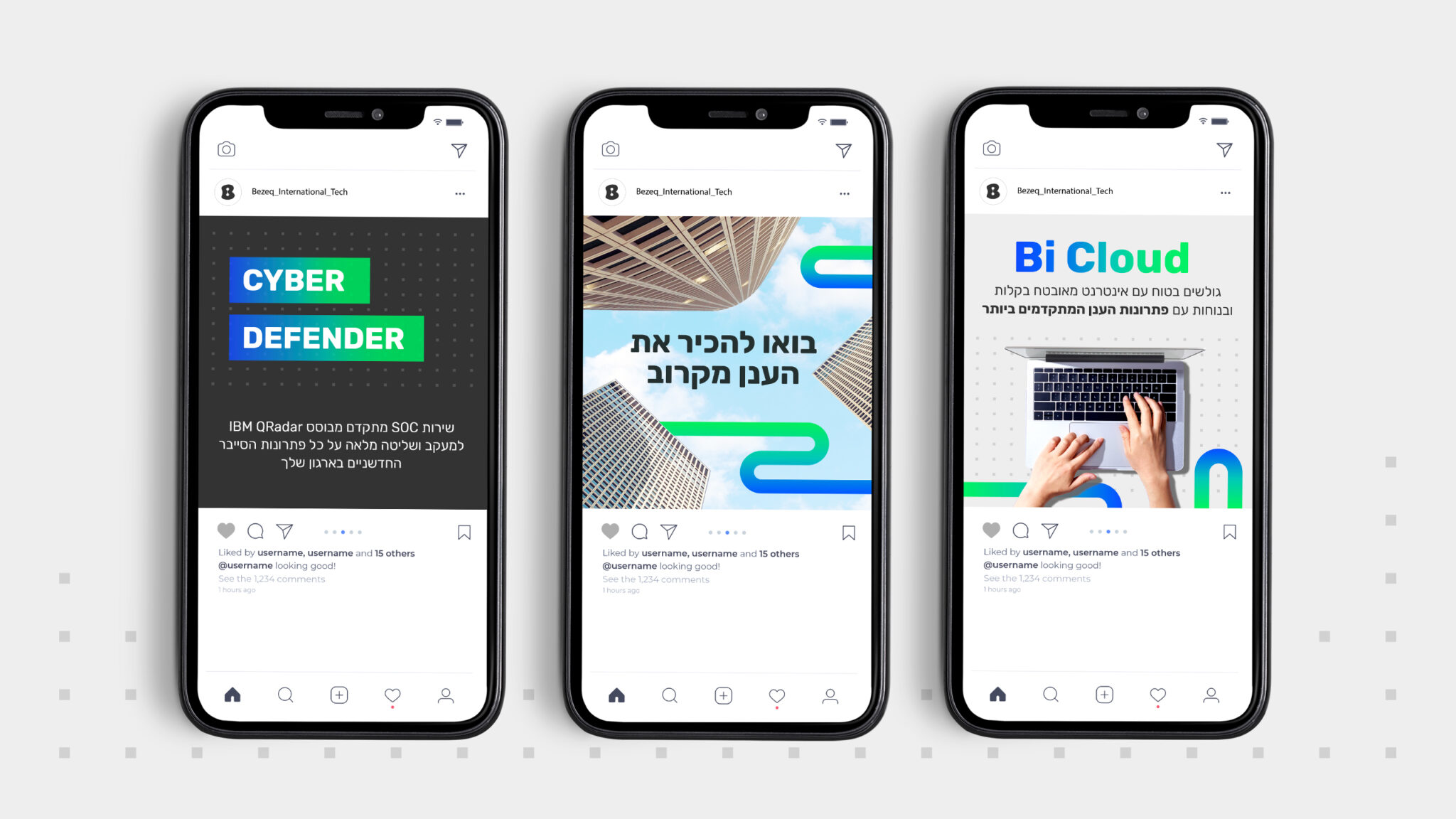
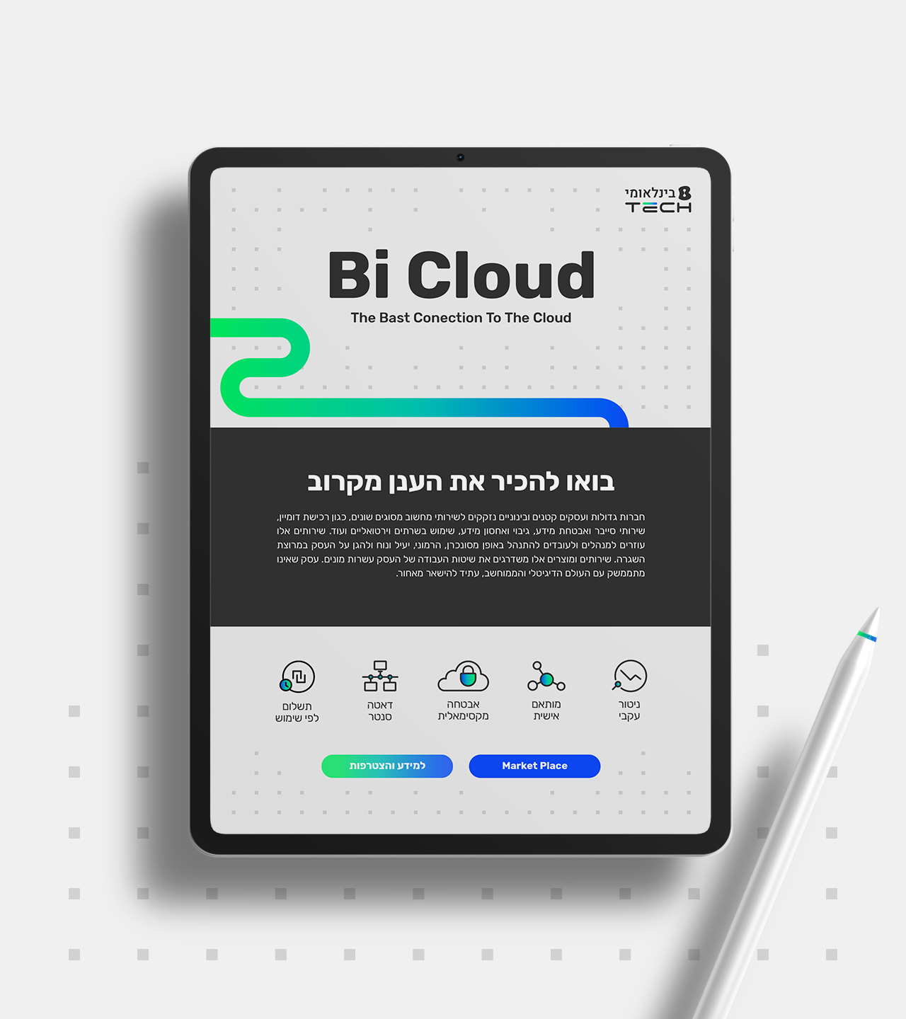
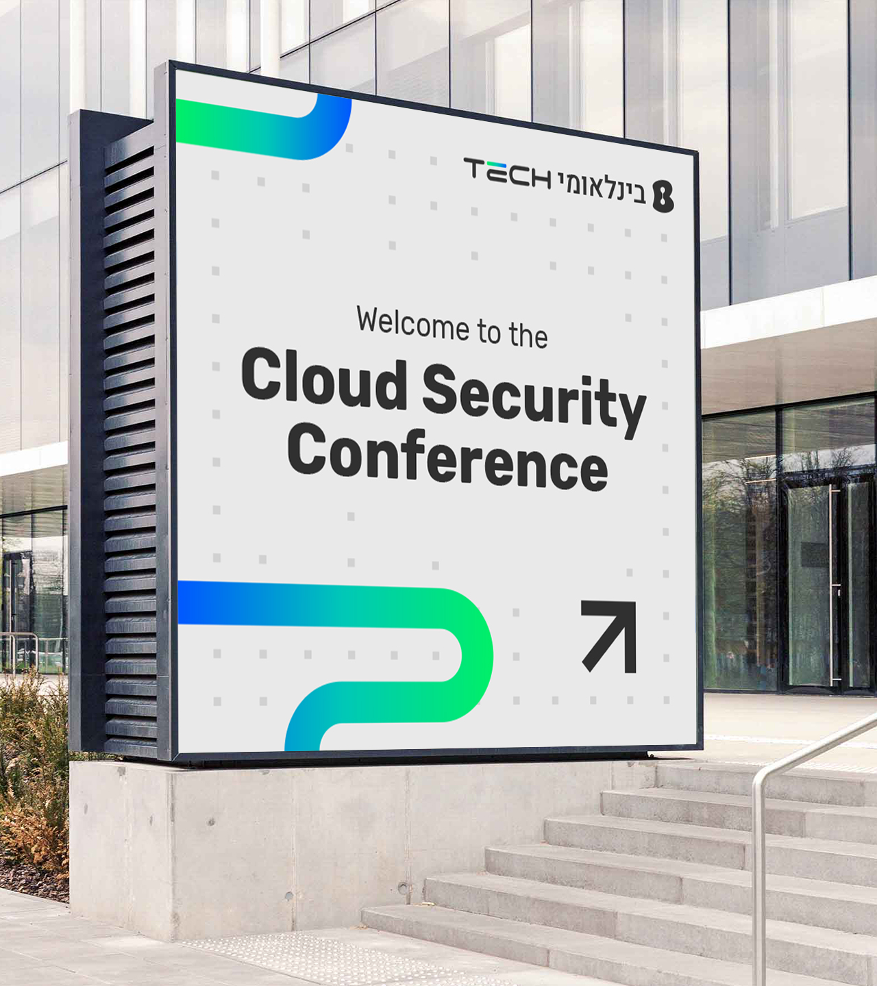
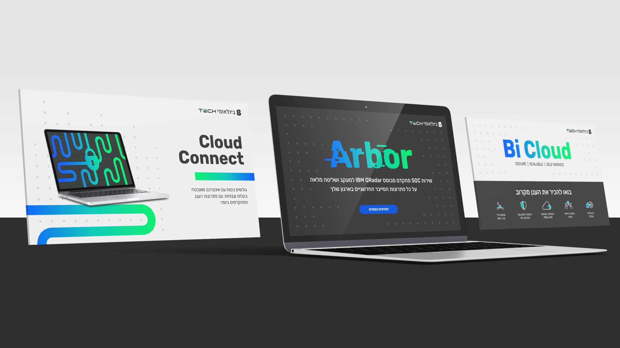
The kinetic fiber is an evolving graphic element, representing progress and innovation, versatility, constant motion, and connectivity.
In the new branding, we chose to keep the essence of the brand's recognizable assets such as the deep blue with refreshing touches of green, and added a clean, bright, open line – basic qualities of the new business activity. All this is topped off by a unique photographic style – a cyber typographical language, supported by a universe of icons and pixels that respond to the many needs of the brand’s diverse audiences.
AfterBefore View Before
AfterBefore View After