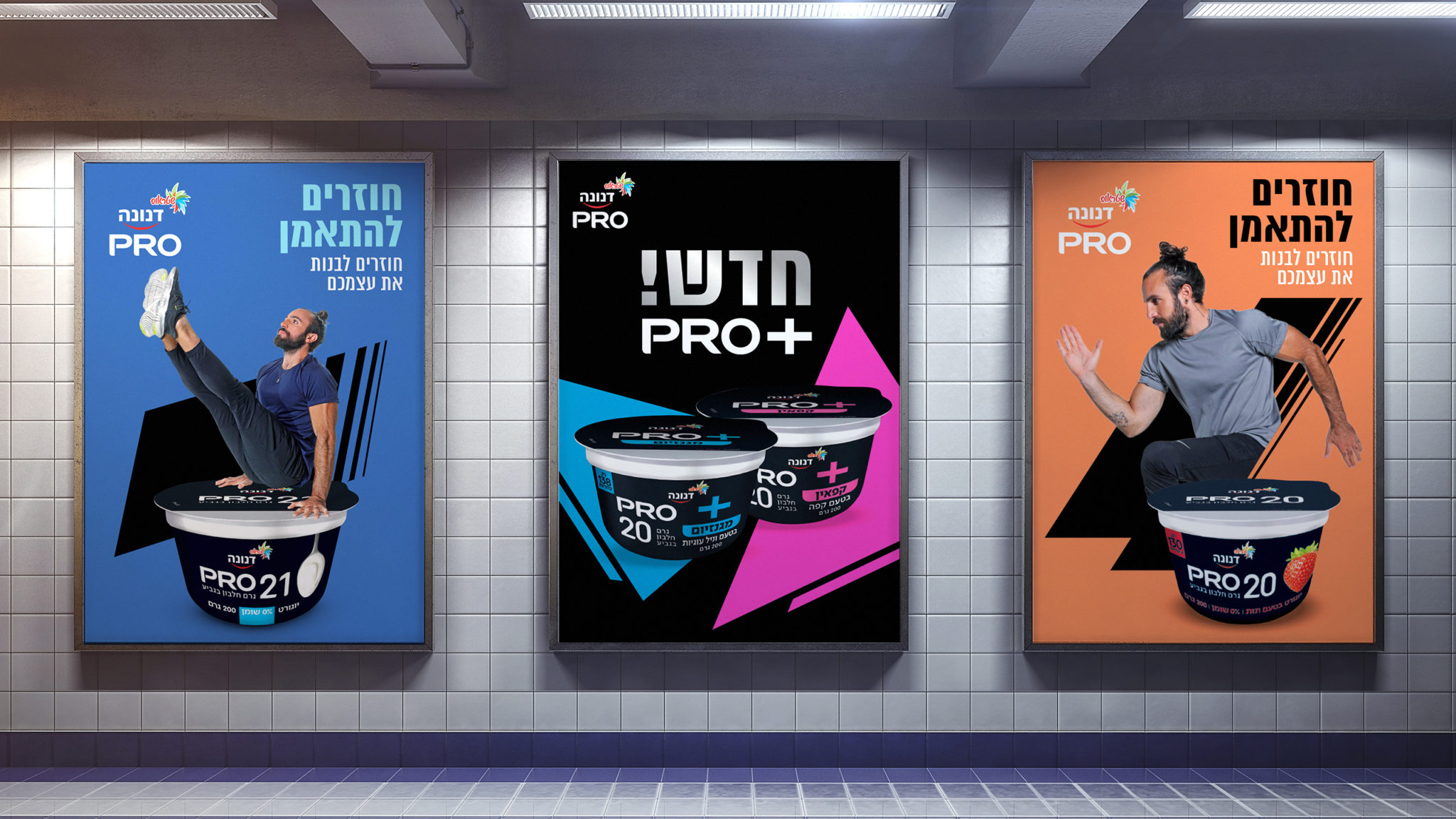
Five years ago we designed Danone Pro, launching the protein revolution in Israel. As competitors followed, Danone Pro’s portfolio reached 50 different products, and the brand became one of the market’s growth engines. Now, we’re here again, and it’s all about evolution.
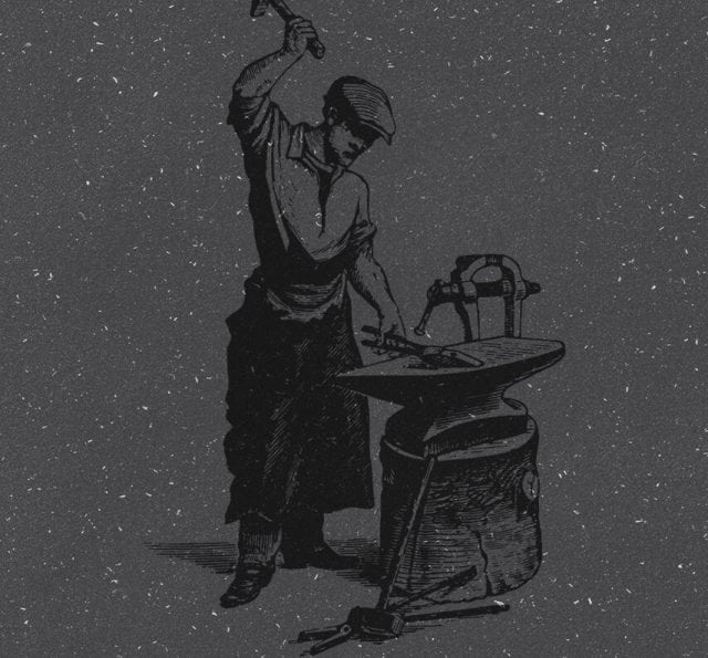
With the ensuing flood of protein products, the challenge lies in differentiation that’s still consistent with the brand’s ecosystem. Danone means health, family, science. Within those values, Danone Pro is highly specialized and professional. It’s about building your body—and building your whole self.
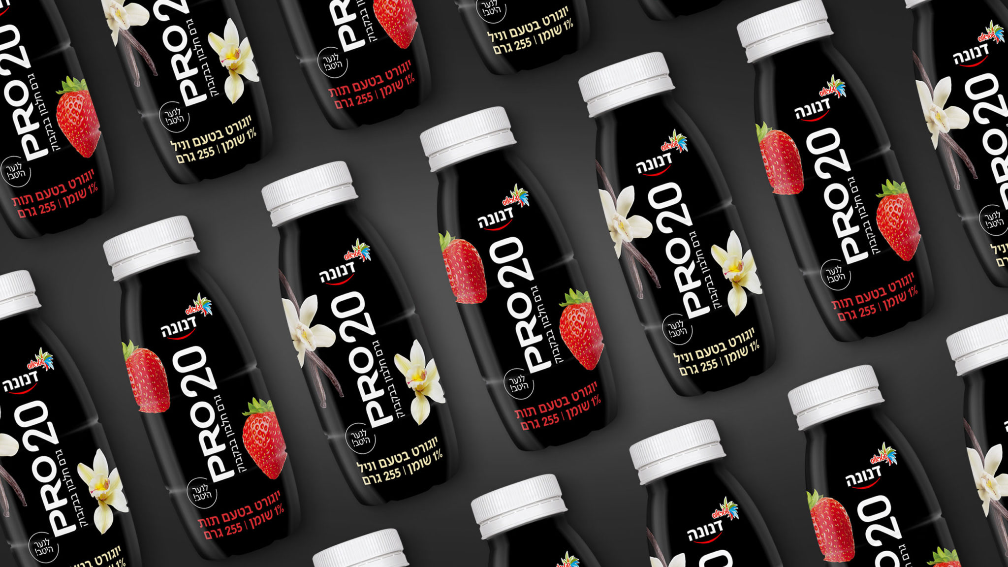
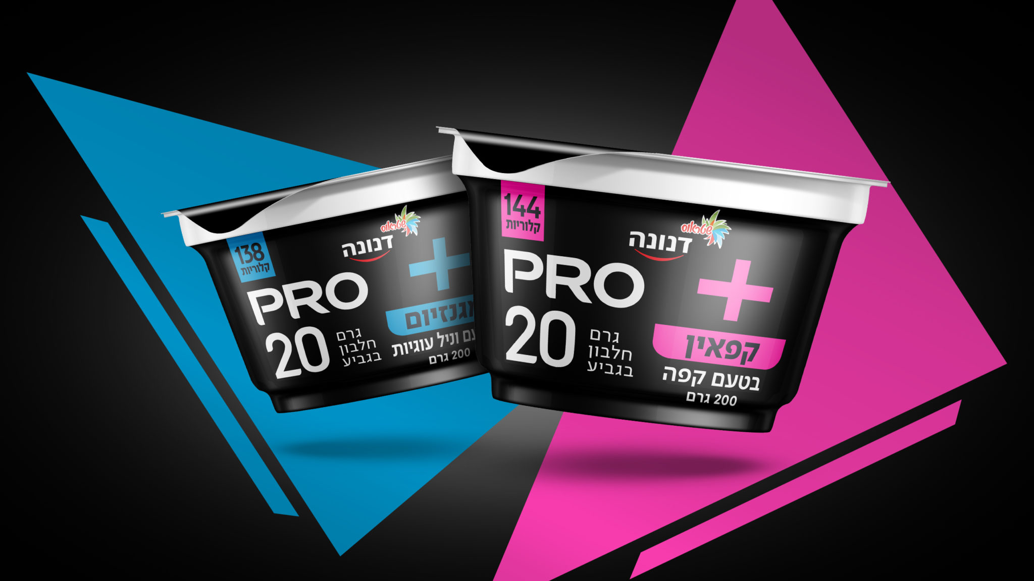
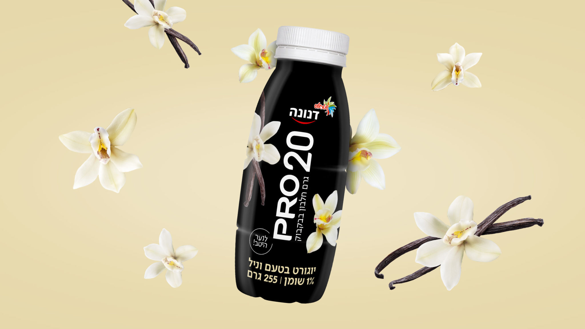
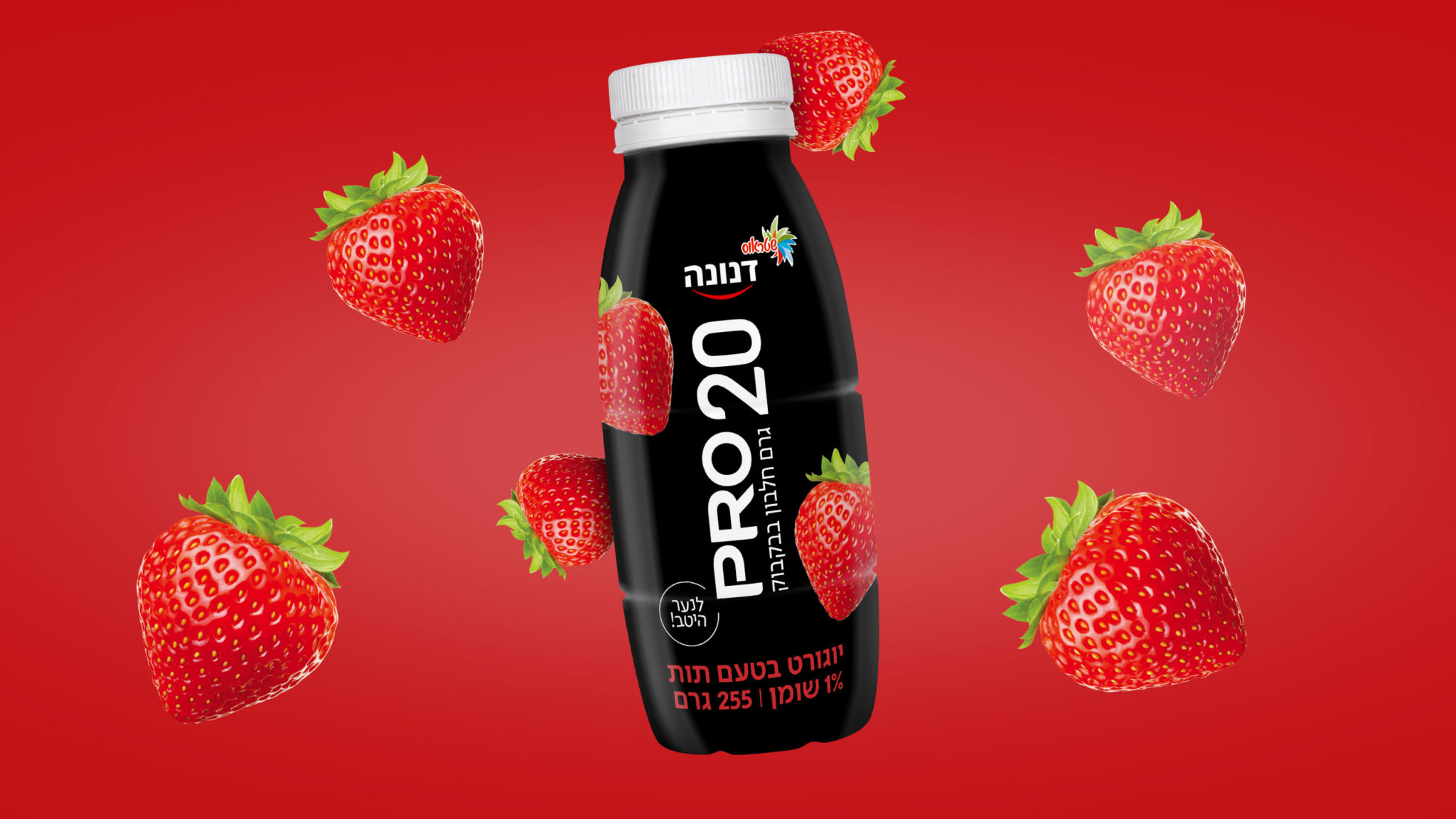
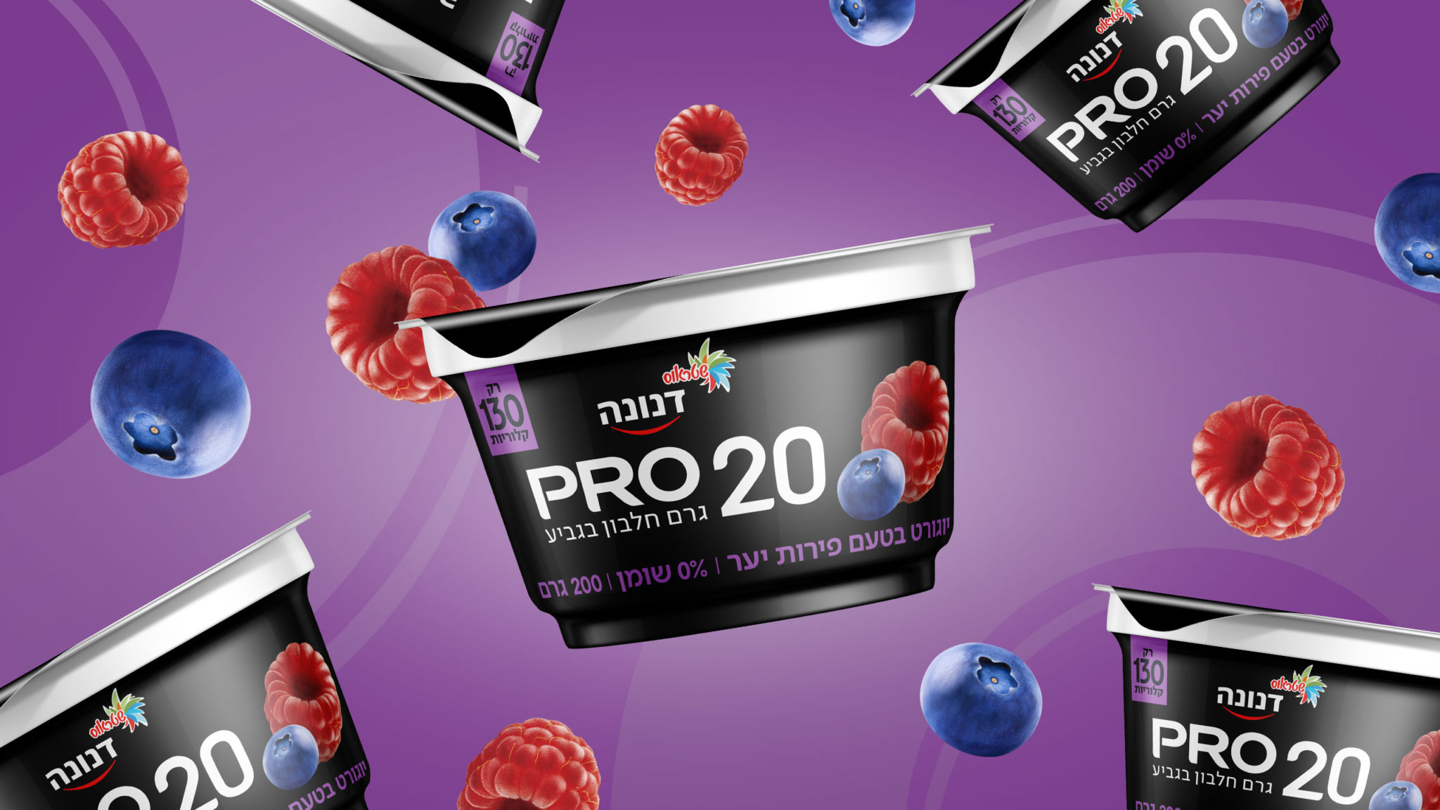
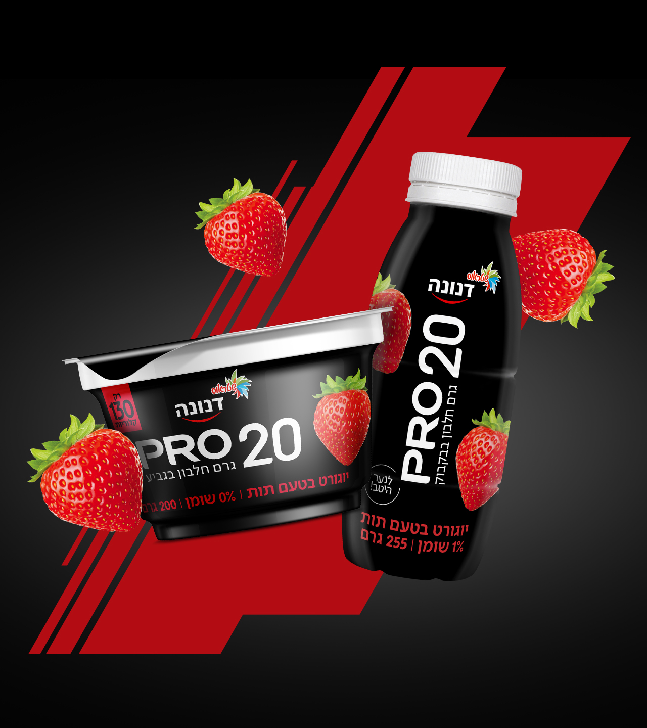
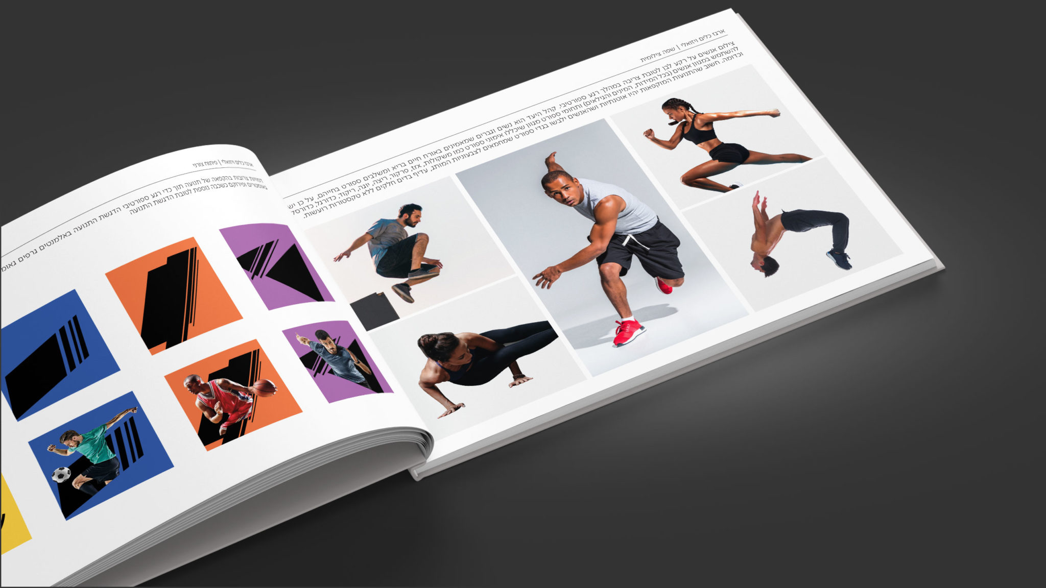
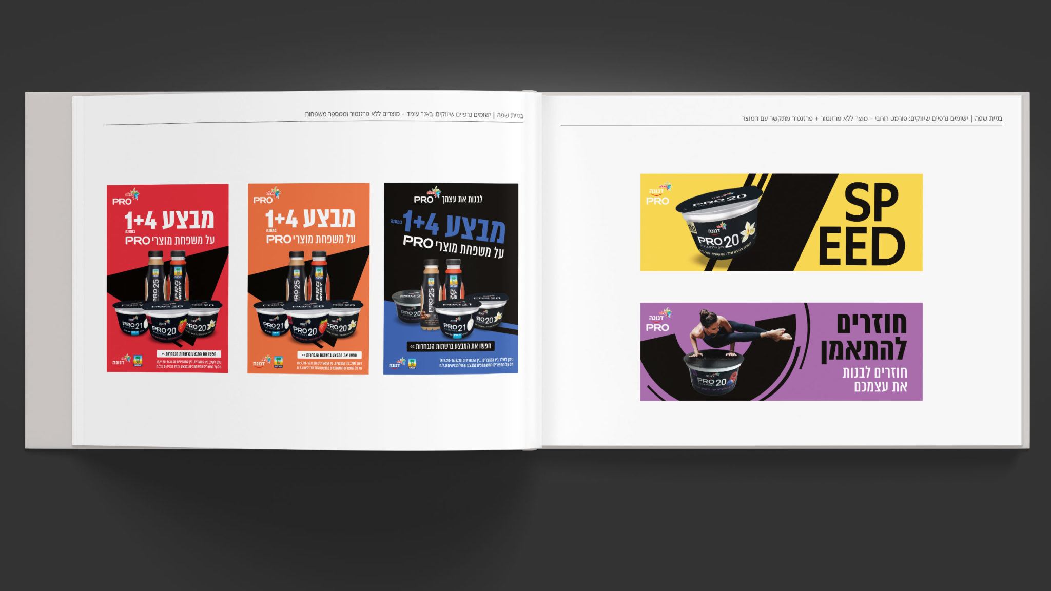
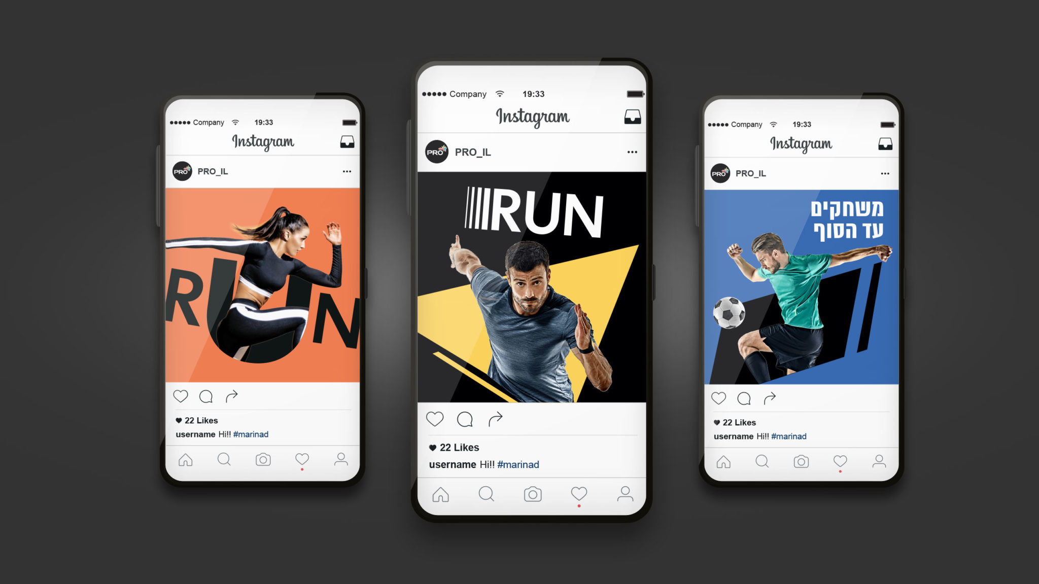
We tidied up the look, moving towards a black background with an active, daring, prominent position on the shelf. We stretched the brand’s language towards a more dynamic tone and style: Diagonal lines that convey motion. Sharp corners that show intensity and strength.