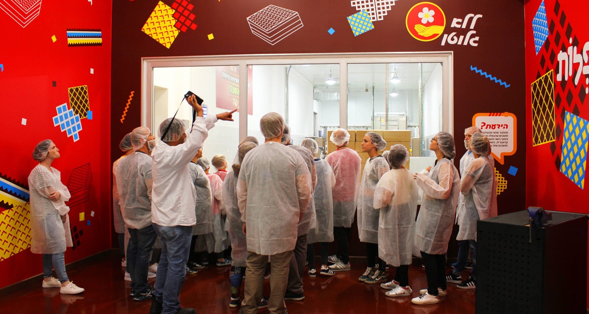
When Elite decided to develop a brand identity and graphic language, we took the lead on the project, ultimately creating a clear voice for the sweets market leader, house of brands.
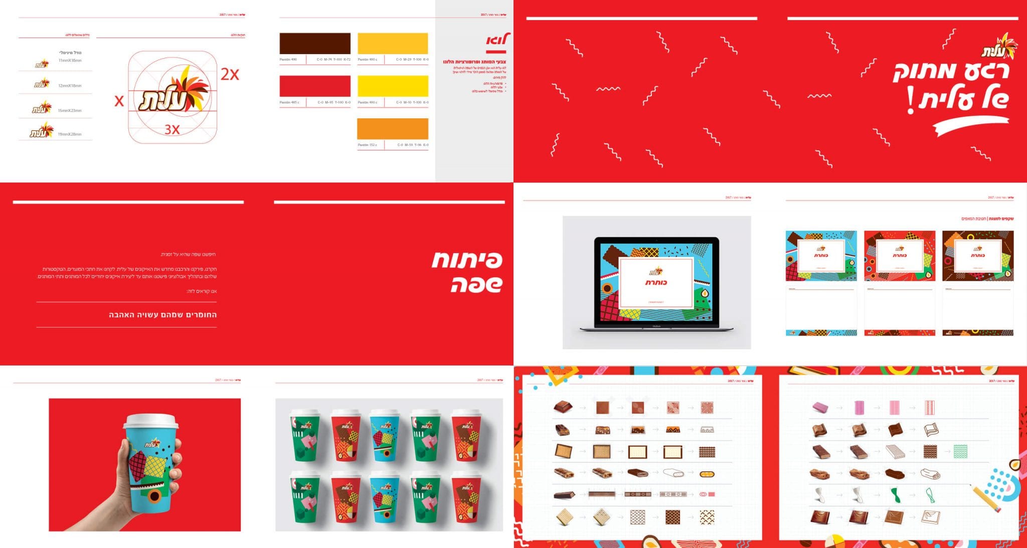
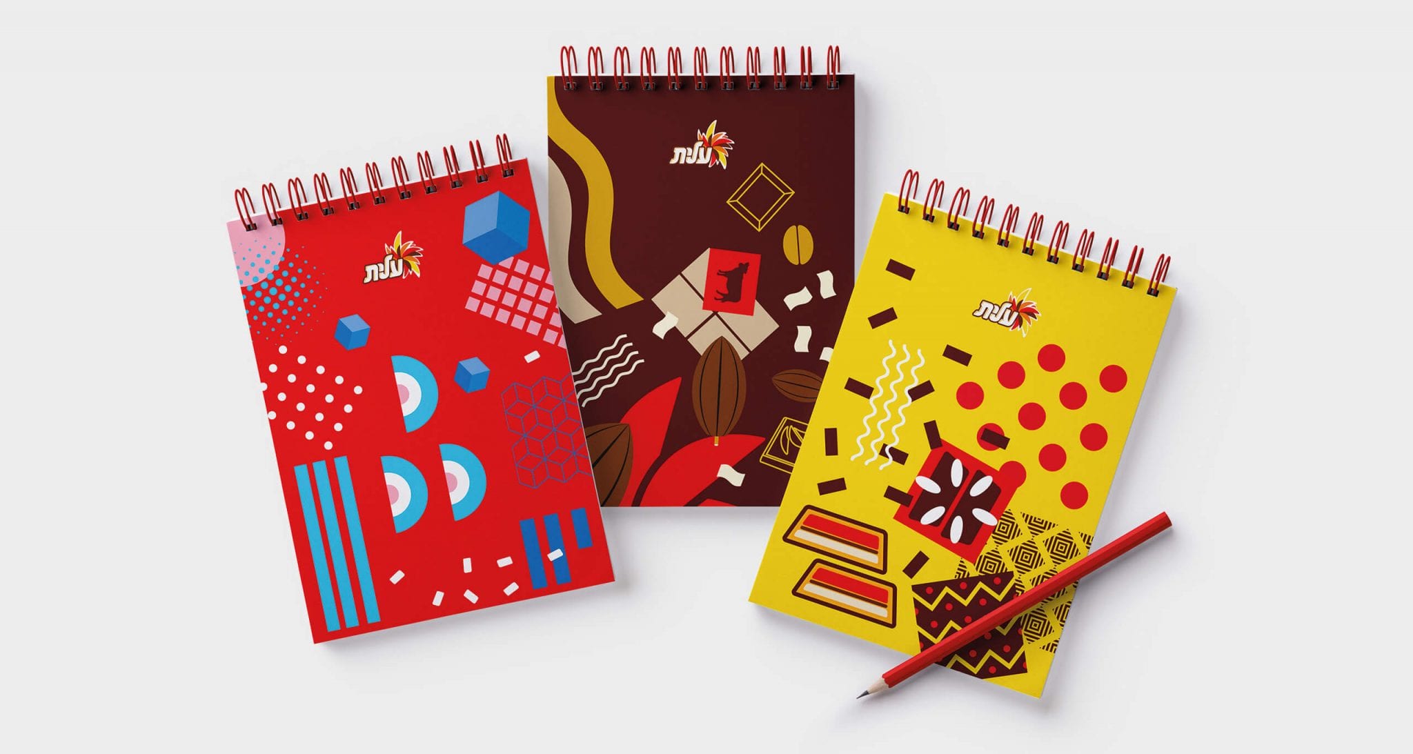
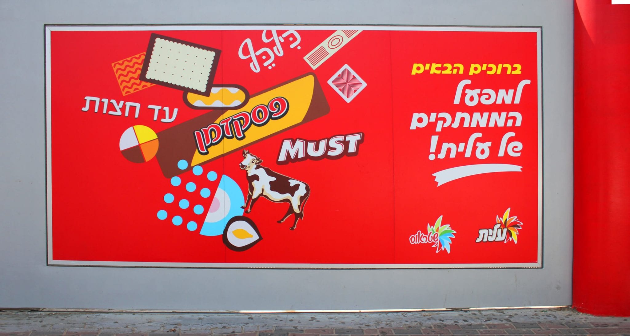
The challenge was to create a distinct anchored brand mark, to be applied on all of the Elite brands, which are different from one another.
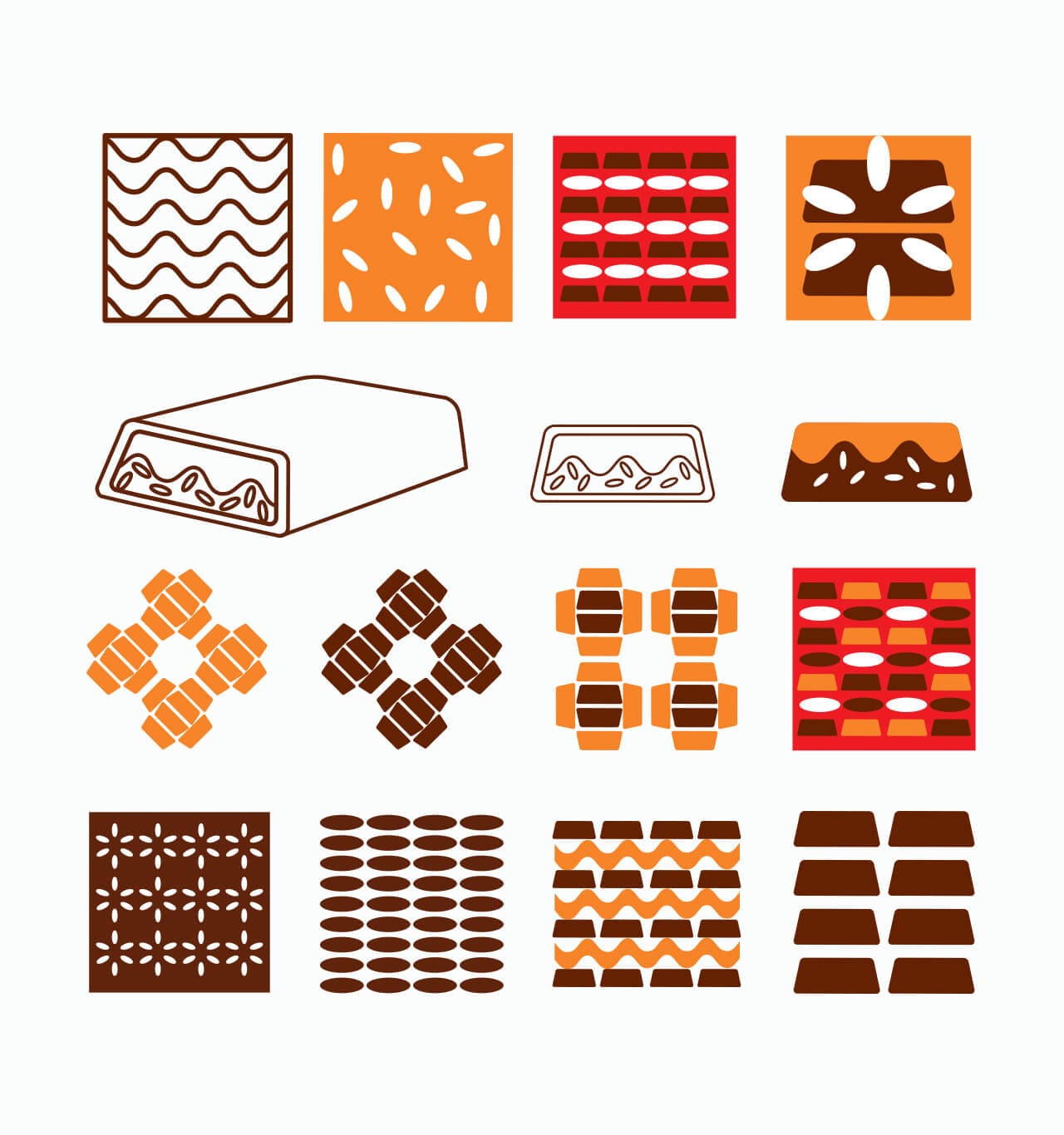
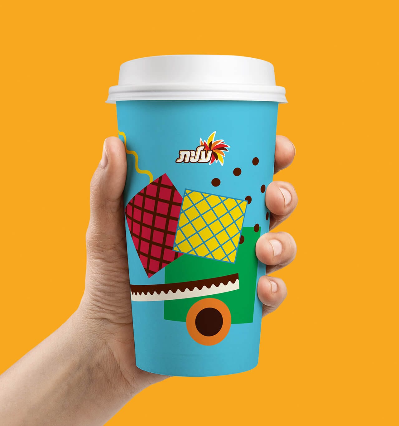
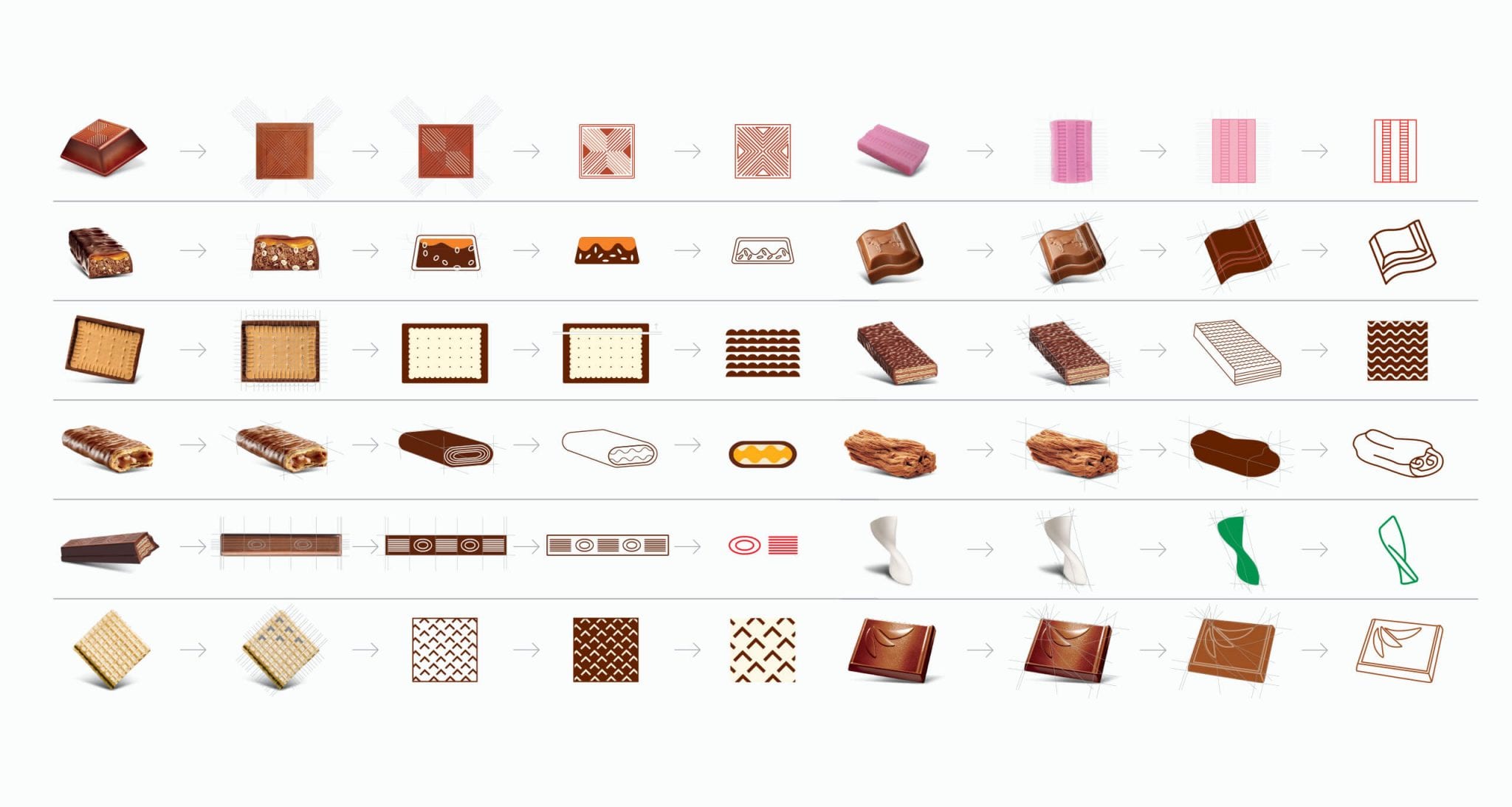
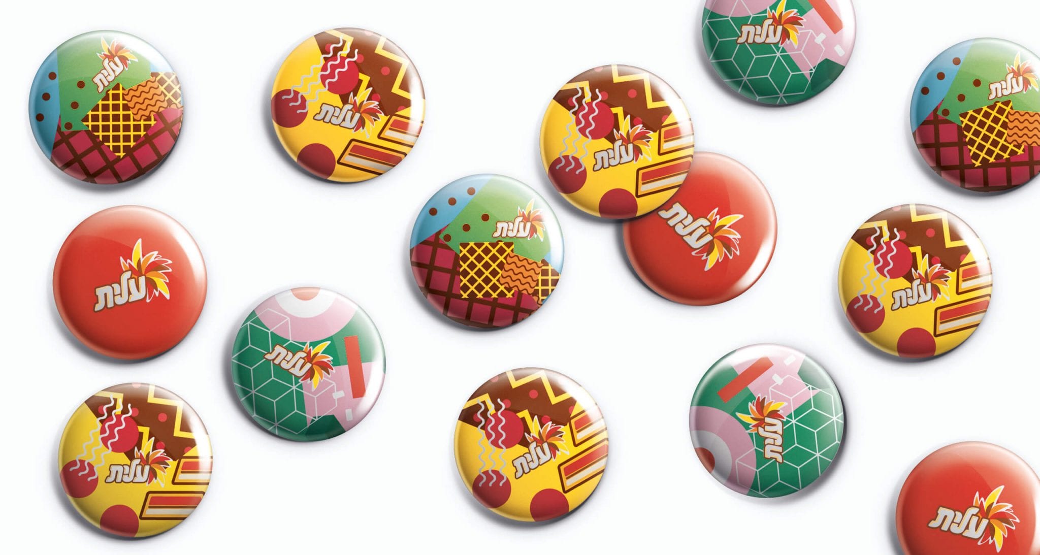
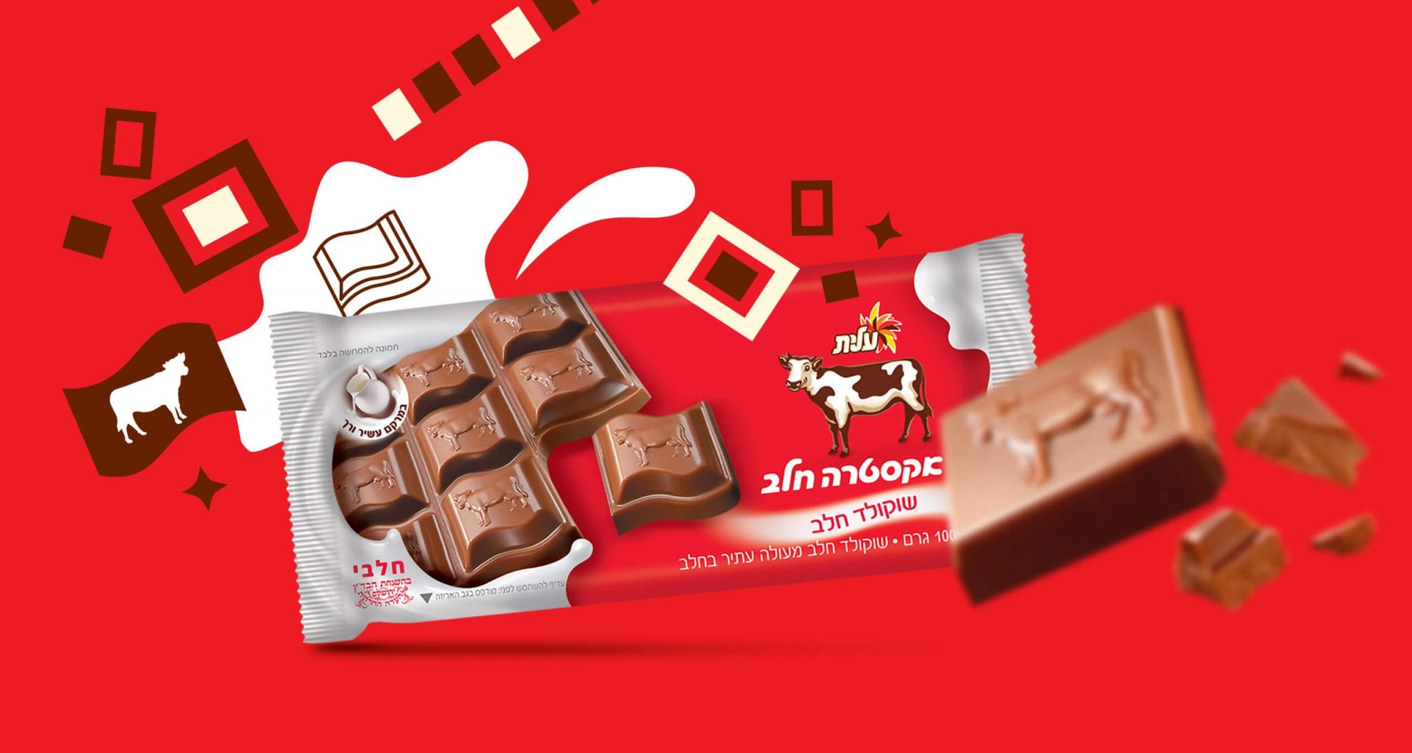
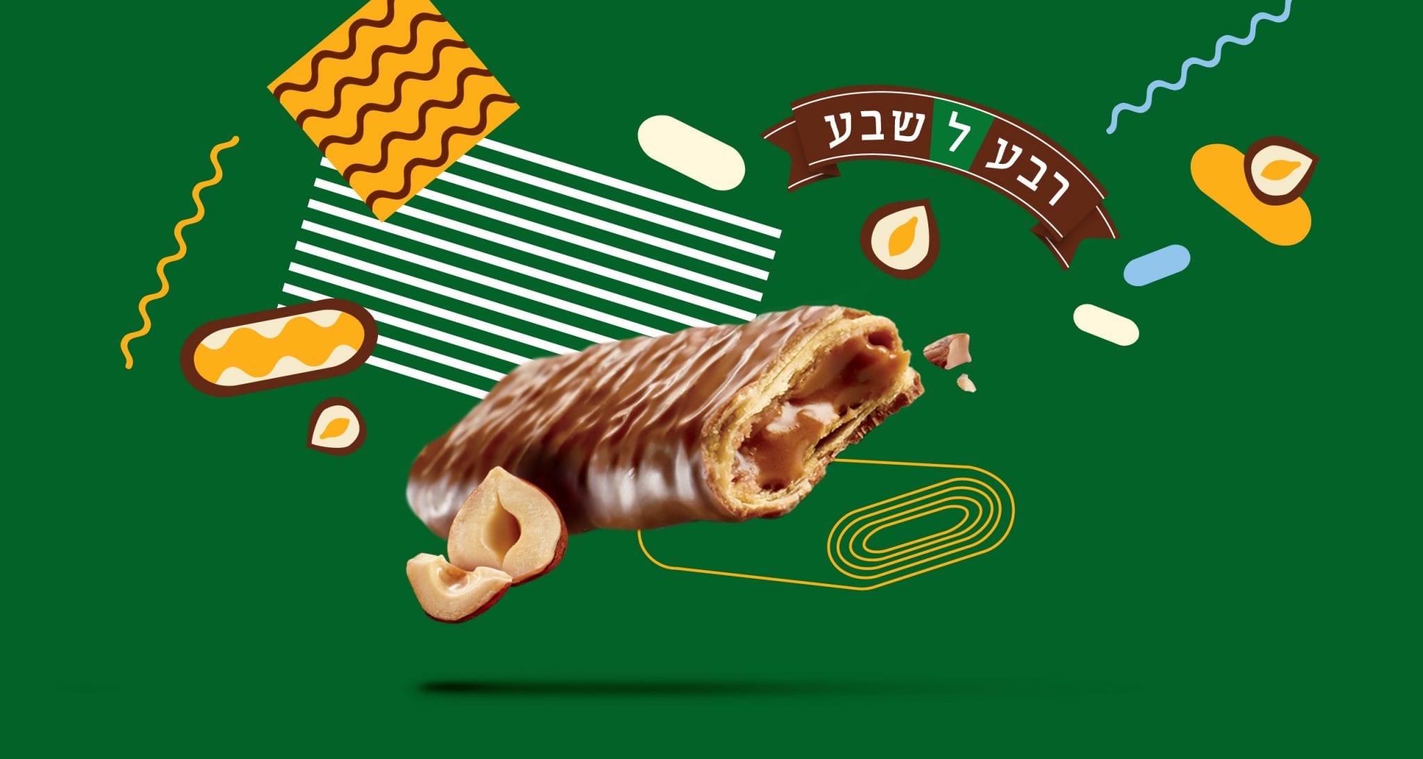
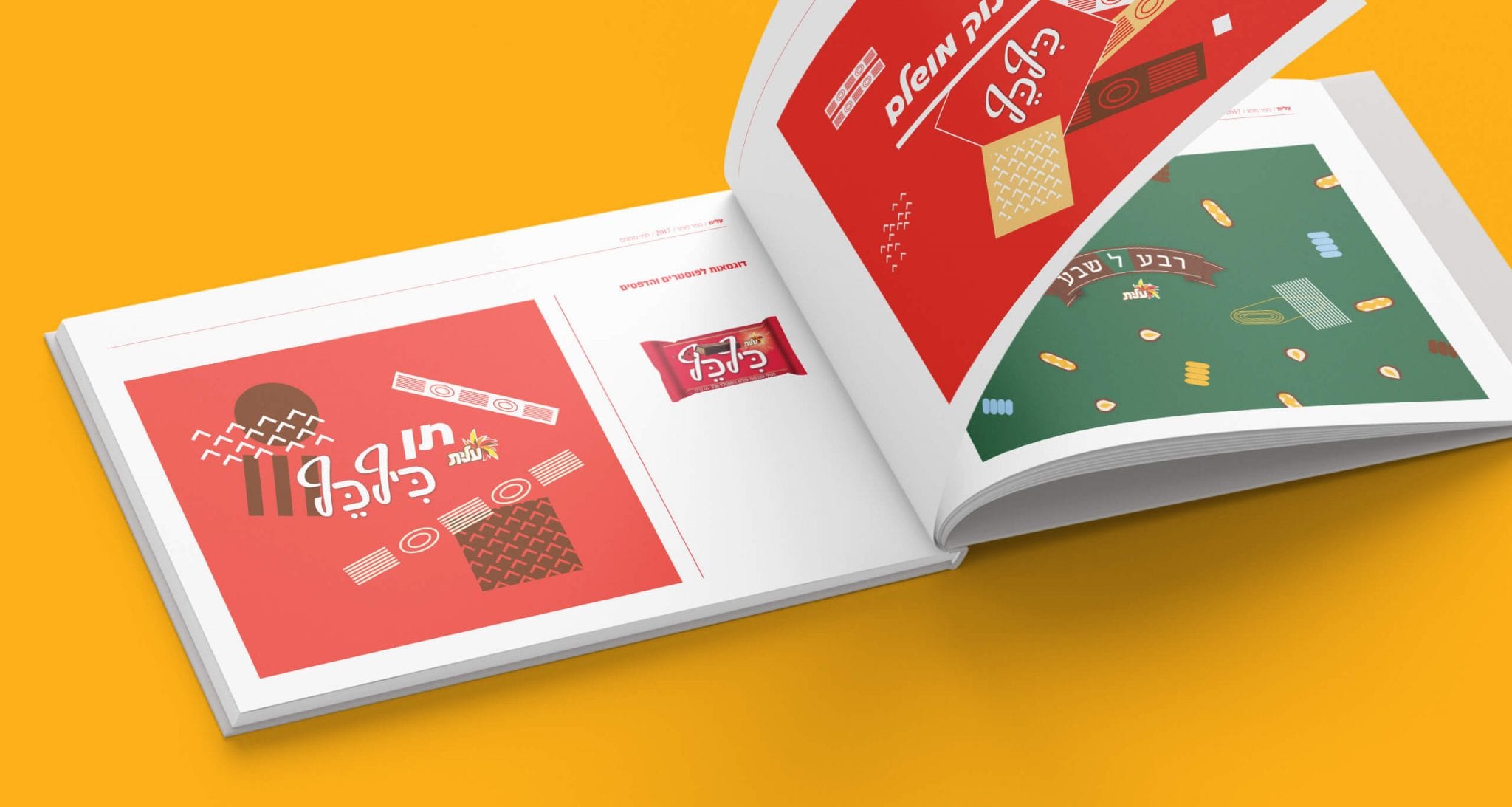
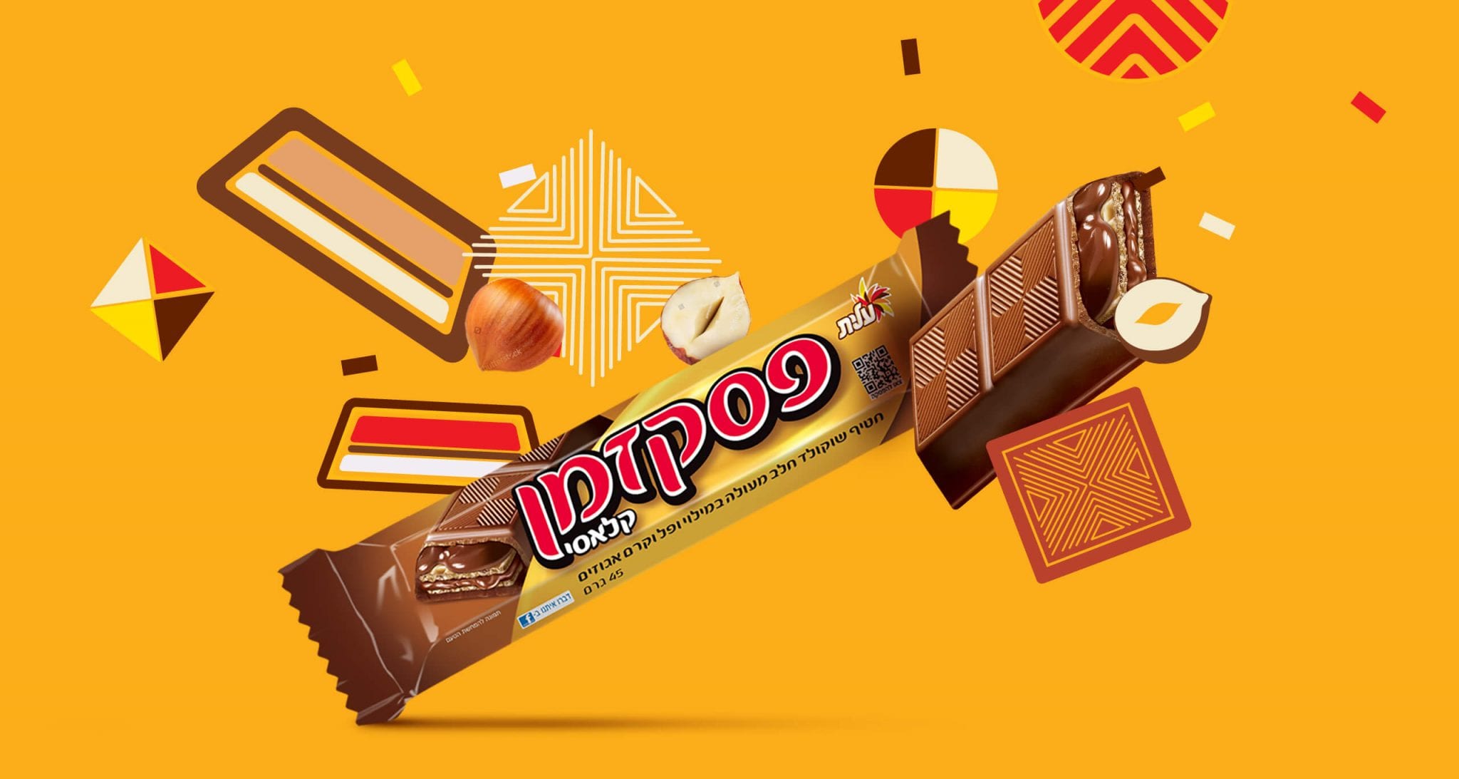
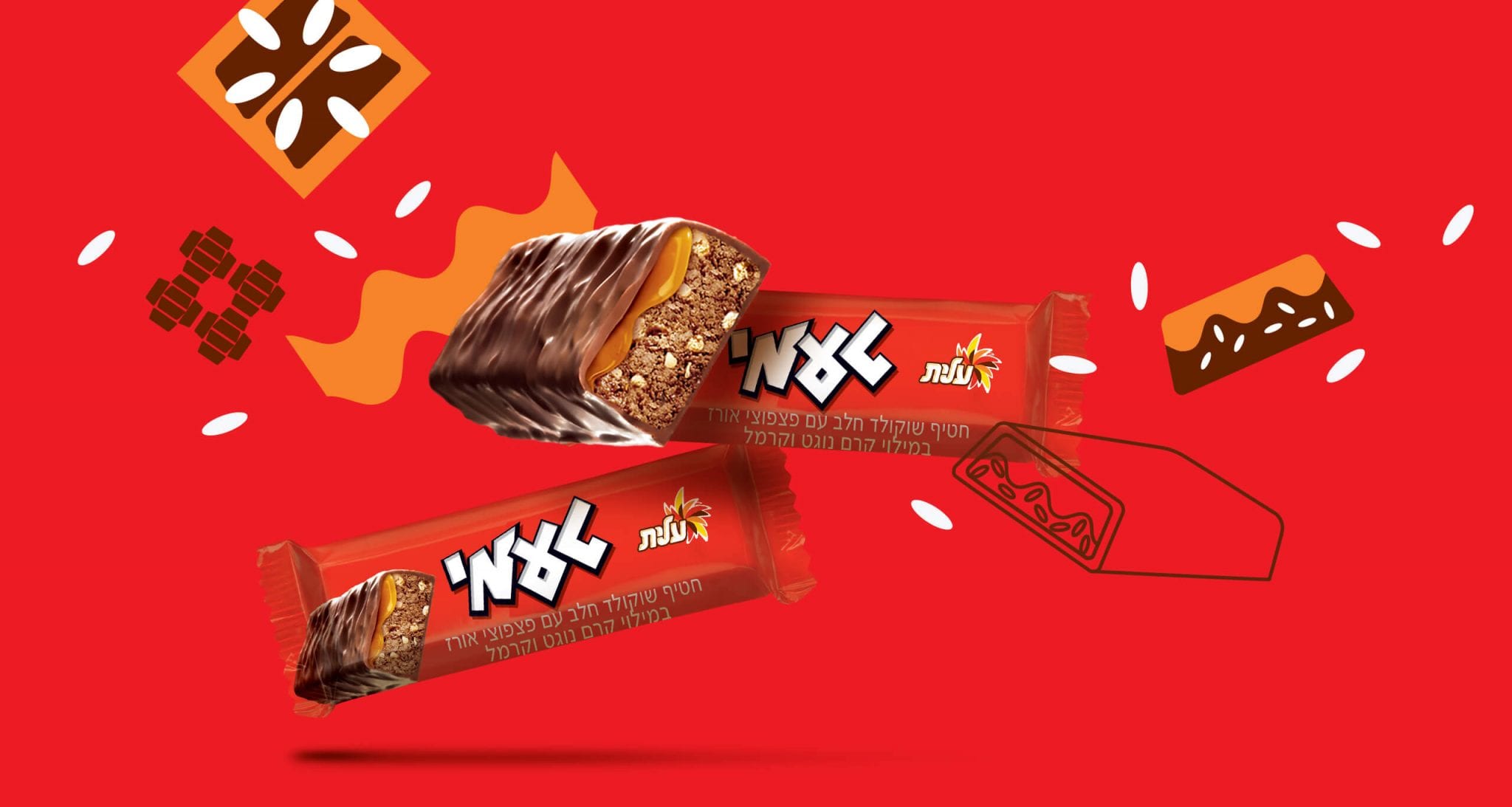
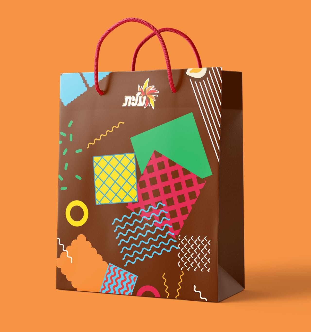
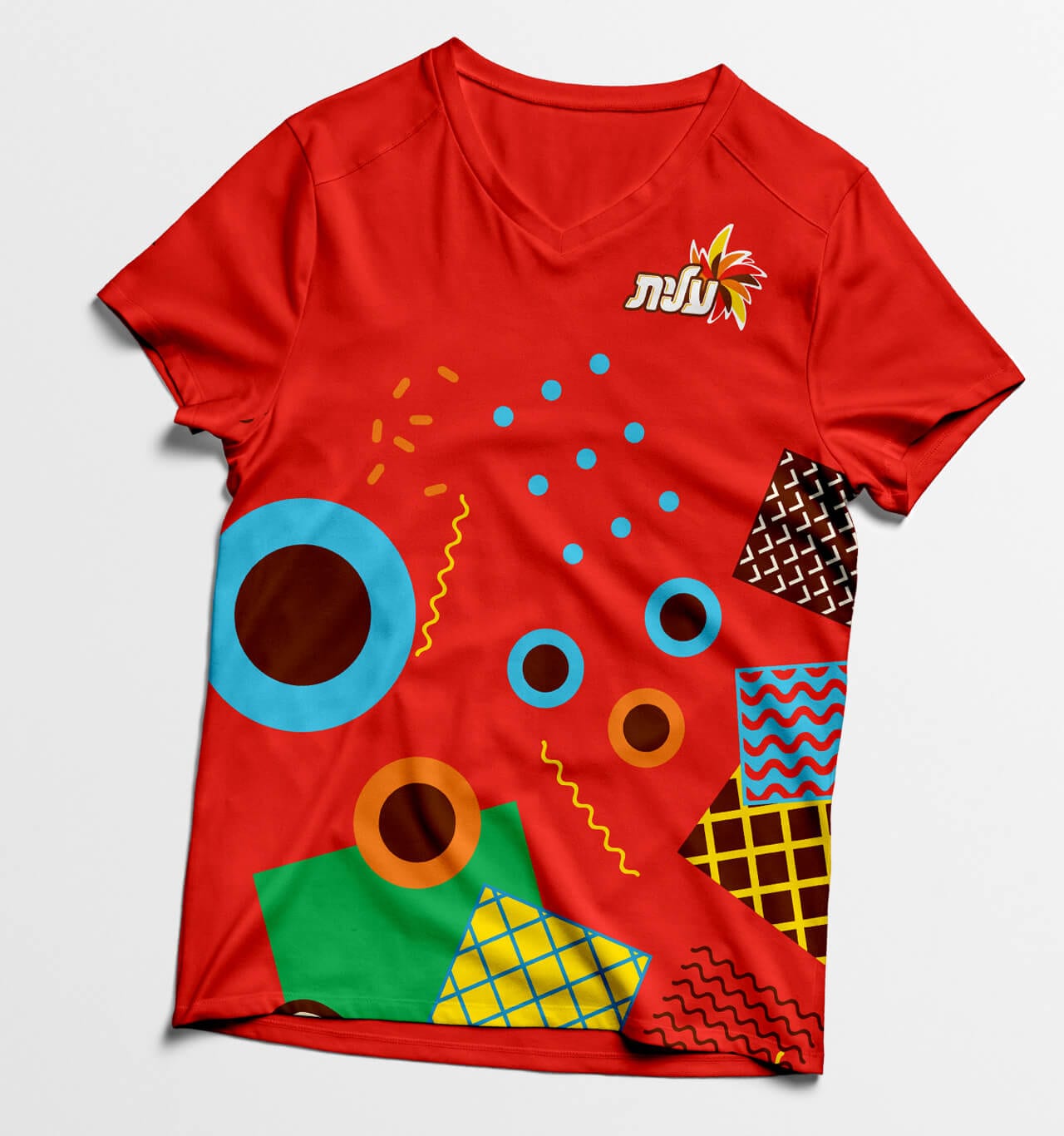
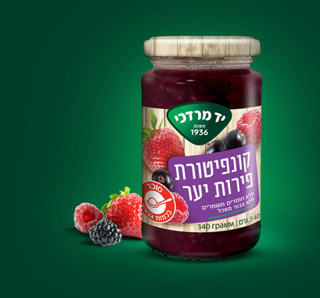
We established an iconic illustrative style that complements the food appeal and nature of Elite, allowing representation of each brand and sub-brand, while leaving room for flexibility to change from product to product, depending on the ingredients, shapes and textures.
The result is a cool and tasty design based on the shapes of the products, that forgoes an expected corporate stuffy look.